Acura Vehicle Features
Redesign of the Acura vehicle features web experience
Role: UX design
Summary
I worked with the team at Wunderman Thompson to refresh Acura's vehicle features web experience. The primary goal of the redesign was to create a compelling narrative with a mobile-first design that could increase clarity and navigational ease as well as boost target engagement metrics.
Problem
How can a redesigned features experience improve navigation, balance simplicity and richness in information presentation, clearly differentiate vehicle packages, and highlight signature Acura features?
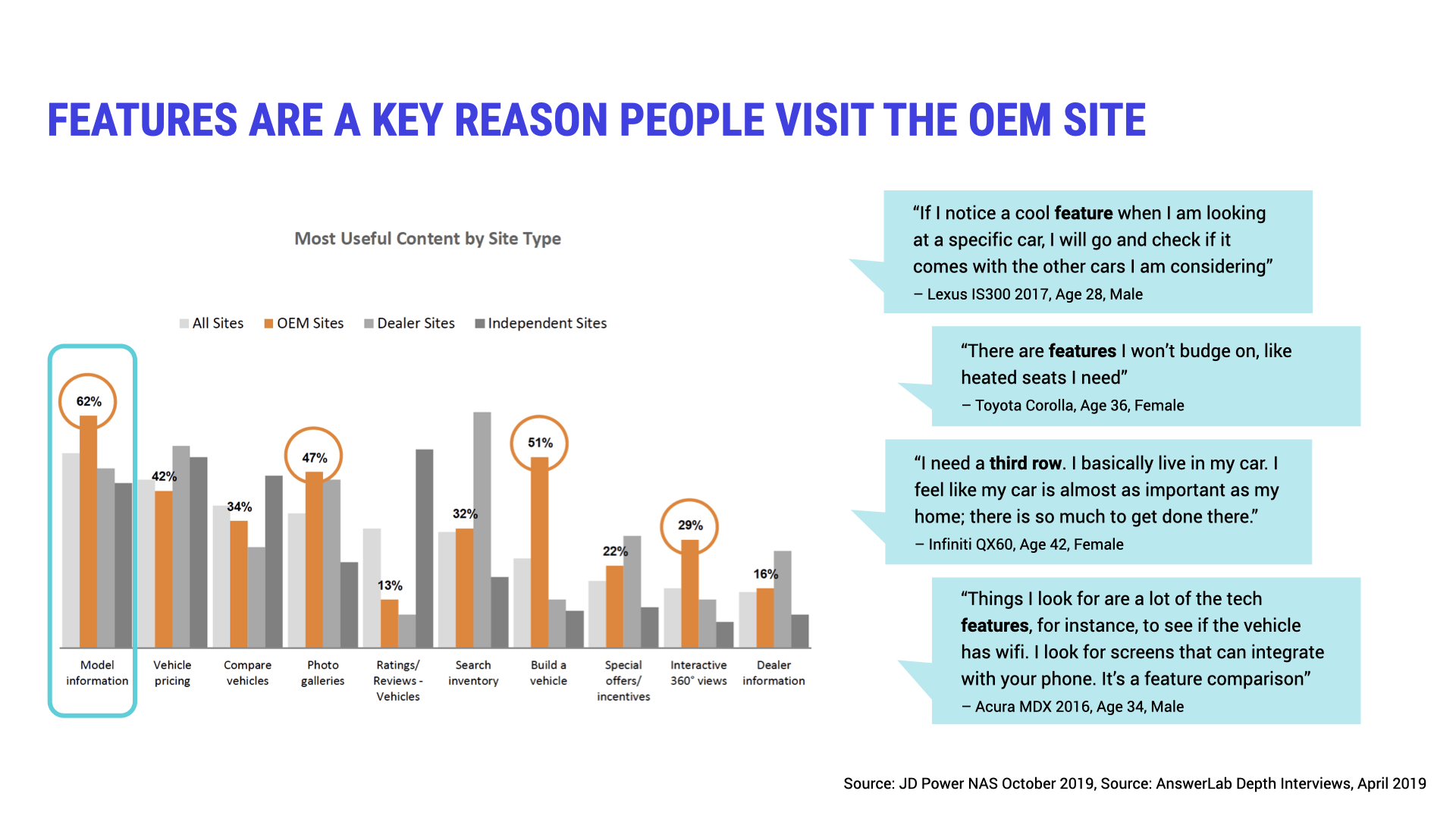
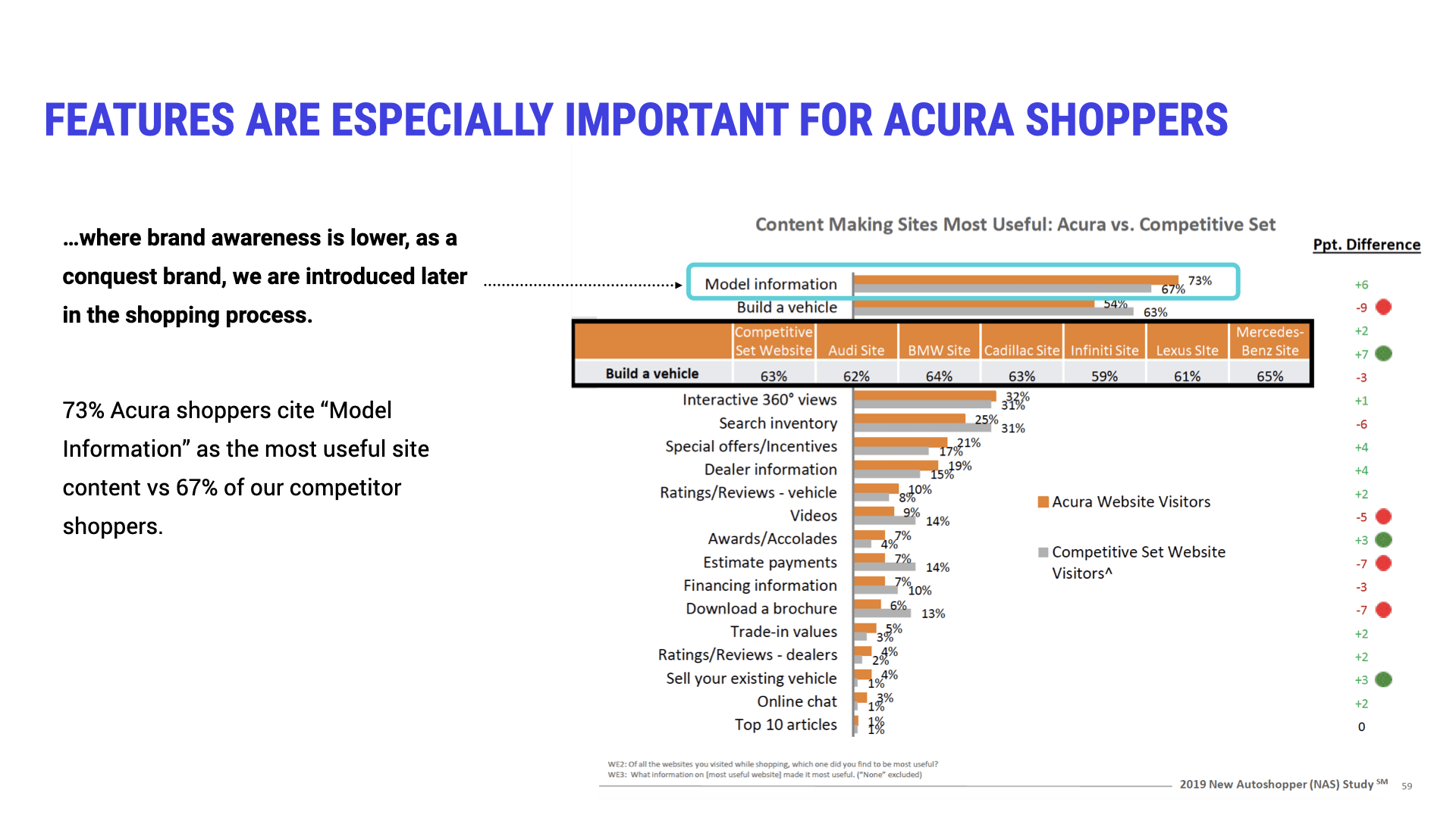
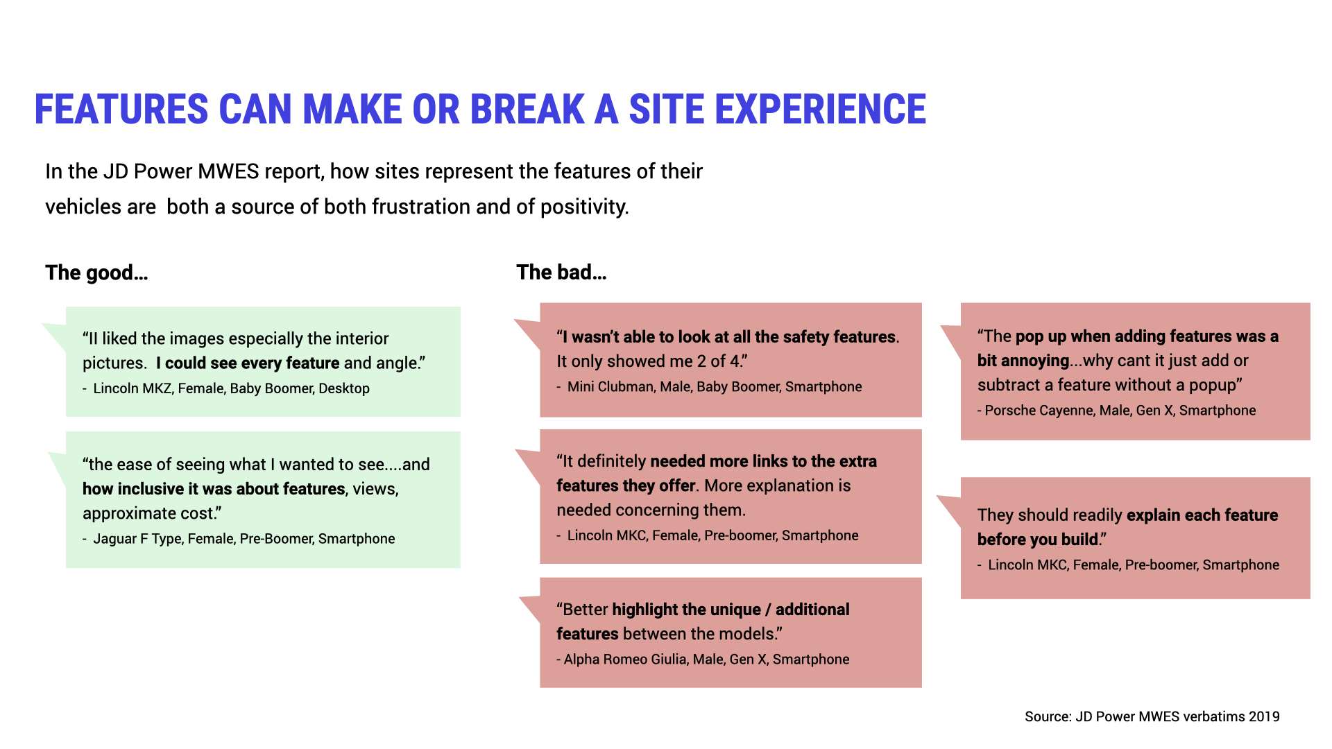
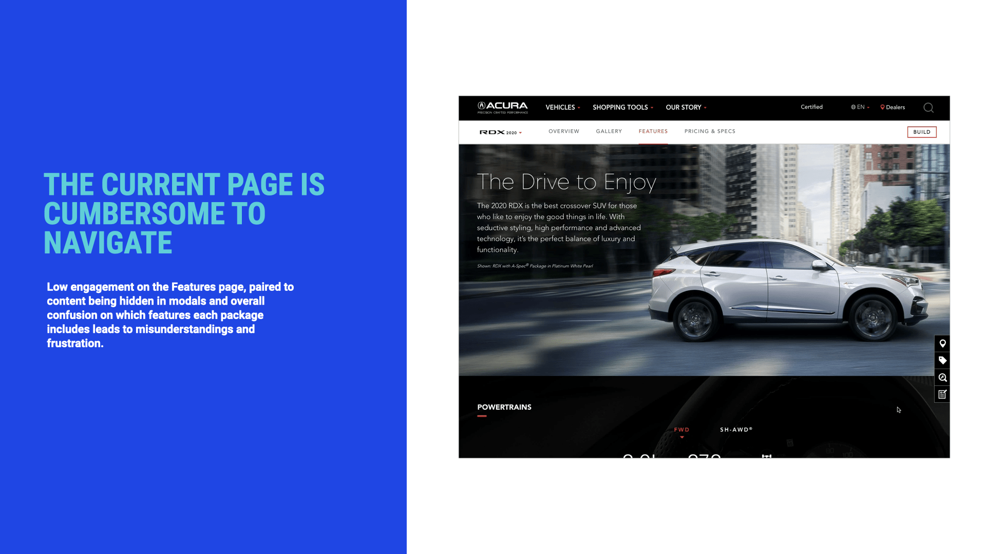
Various J.D. Power studies and customer experience interviews that shaped the brief revealed that model information about vehicle features ranks among customers' most important reasons for visiting auto OEM websites and that this holds especially true for Acura shoppers. Multimedia like images, video, and interactive 360º visualizations conferred an advantage from the customer point of view, while pain points included navigational difficulties, information comprehensiveness, and feature differentiation—both between Acura and competitors and within the different trims offered for a vehicle.
Design brief excerpts: importance of features and customer experience insights
Inspiration & Exploration
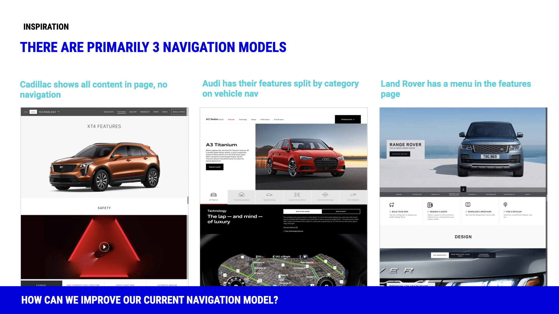
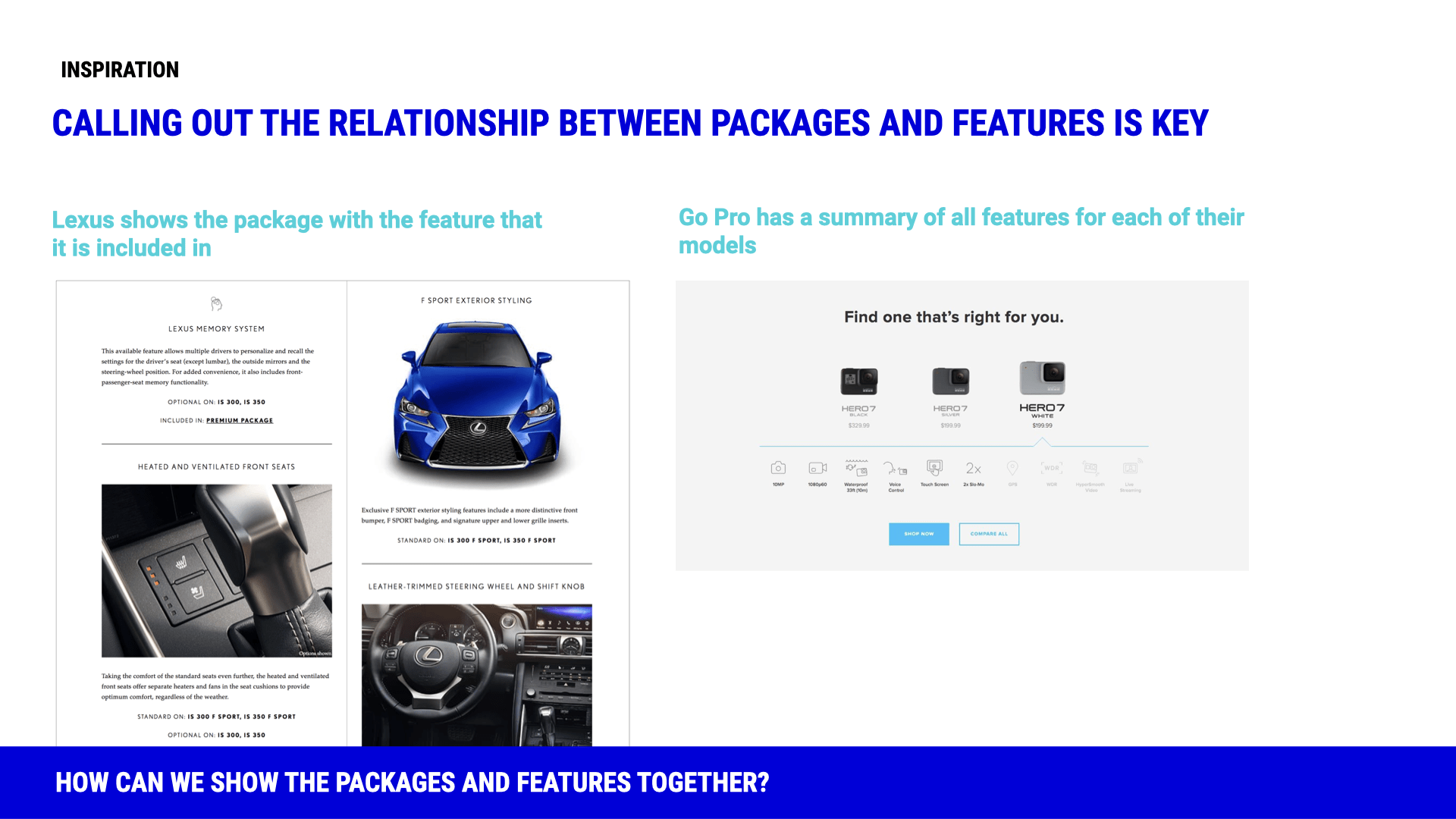
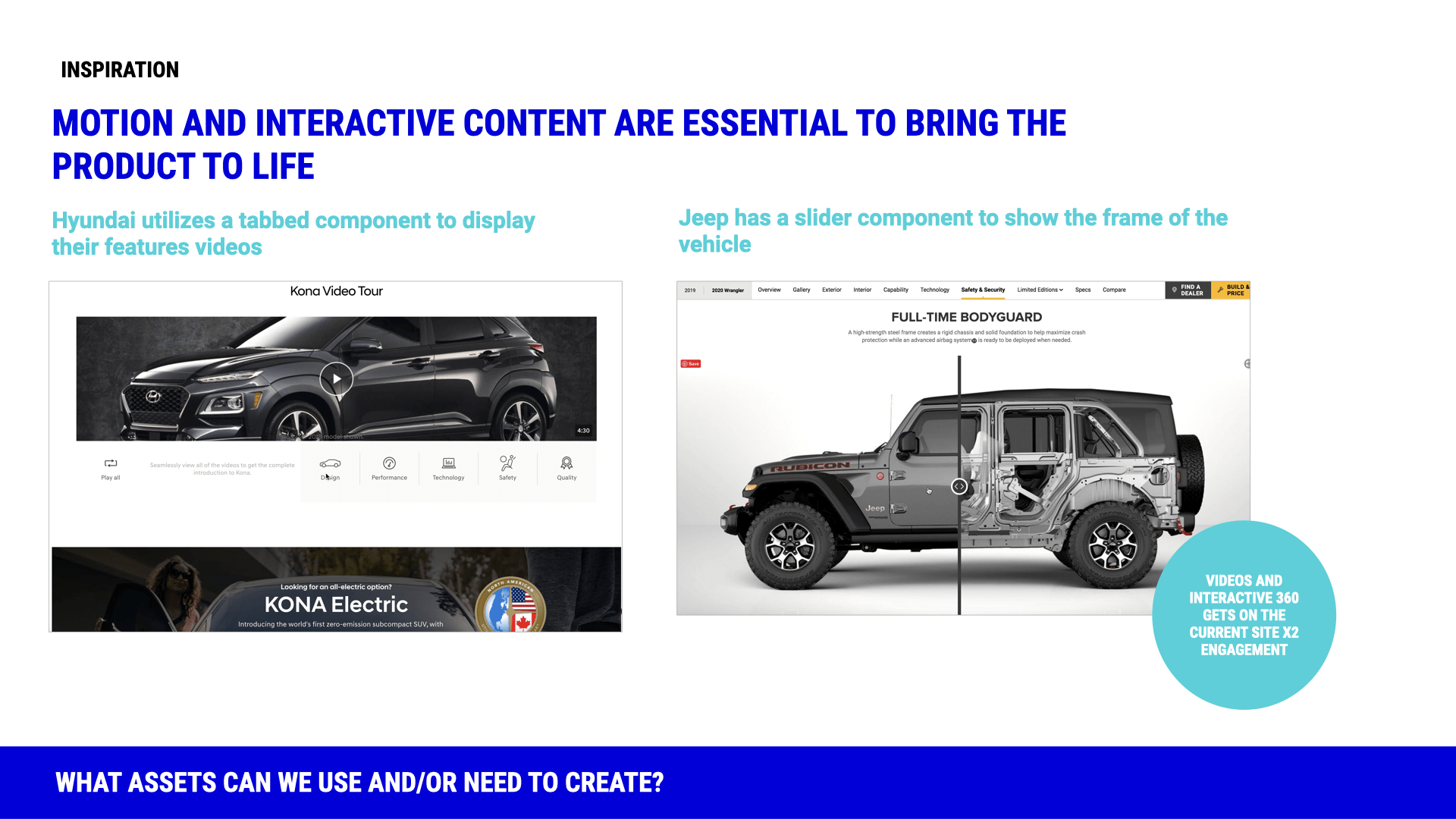
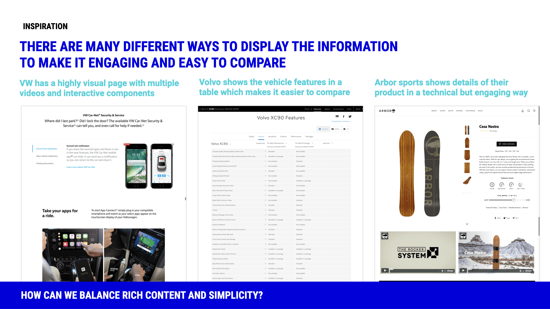
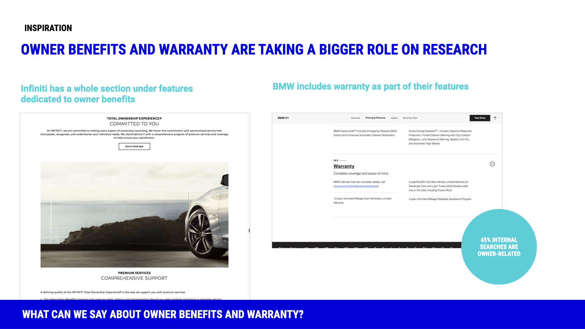
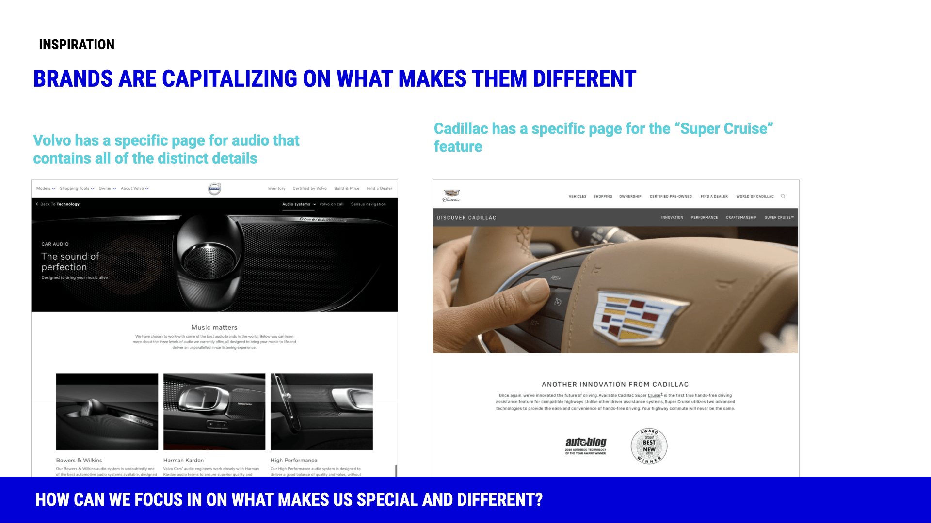
We began explorations for this redesign with a competitive analysis of how other auto OEMs addressed our key pain points like navigation and by reassessing taxonomy as well as seeking out-of-category inspiration. We knew up front that multimedia and interactivity were positively received from Acura's previous performances in J.D. Power's Manufacturer Website Evaluation Studies, so we also brainstormed and sketched rough concepts that could emphasize those strengths and possibly incorporate components from adjacent experiences like model year overviews.
Competitive analysis: navigation, interactivity, trim and brand differentiation, etc.
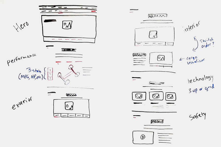
Initial whiteboard and wireframe explorations of navigation and components
Data & Analytics
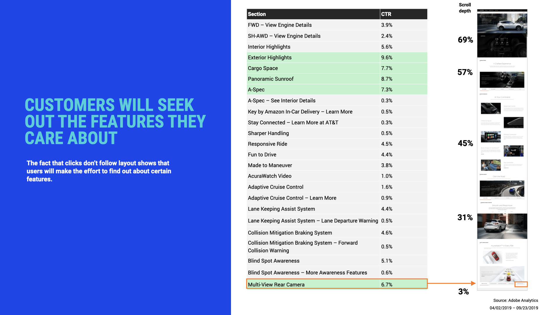
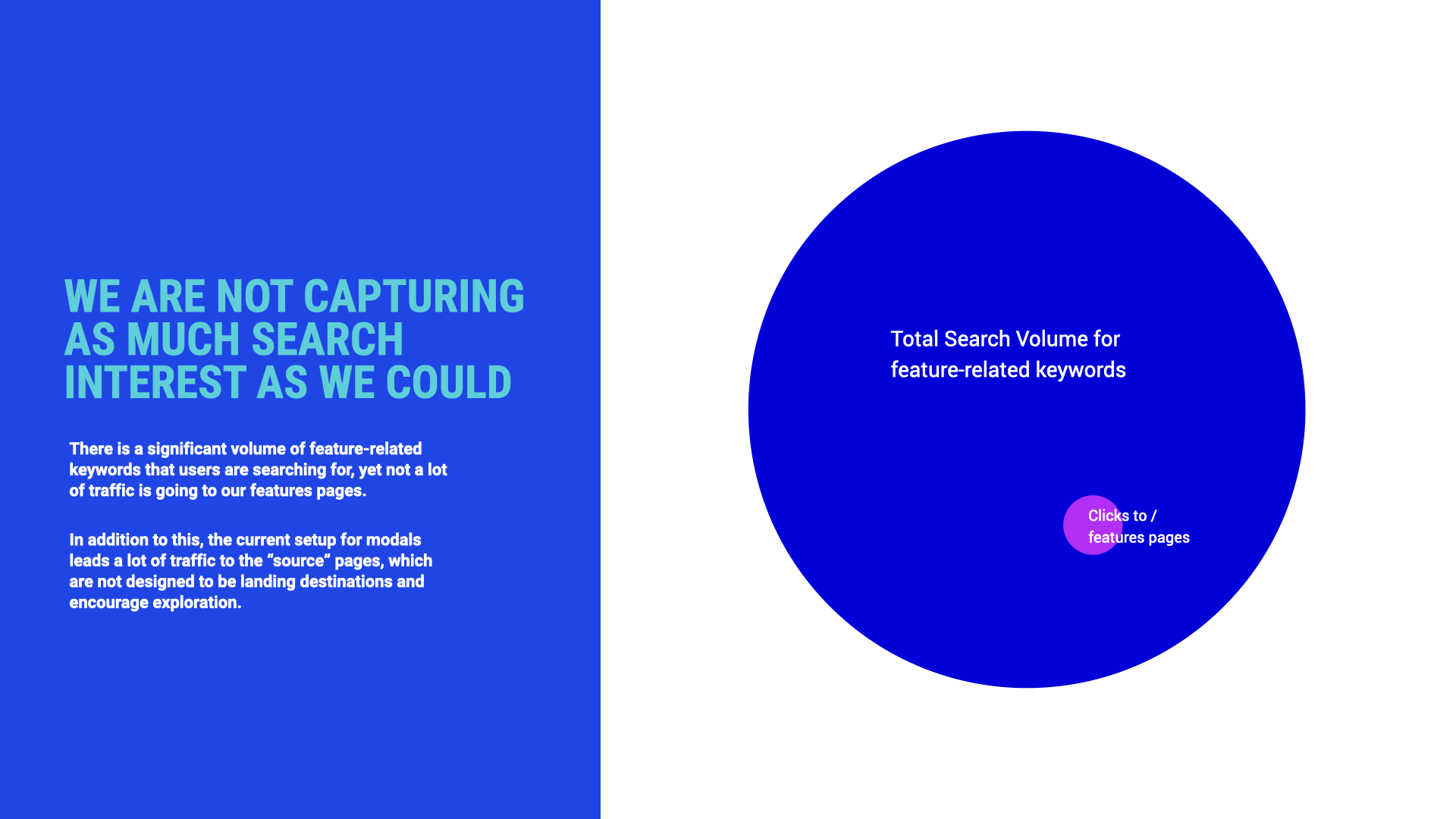
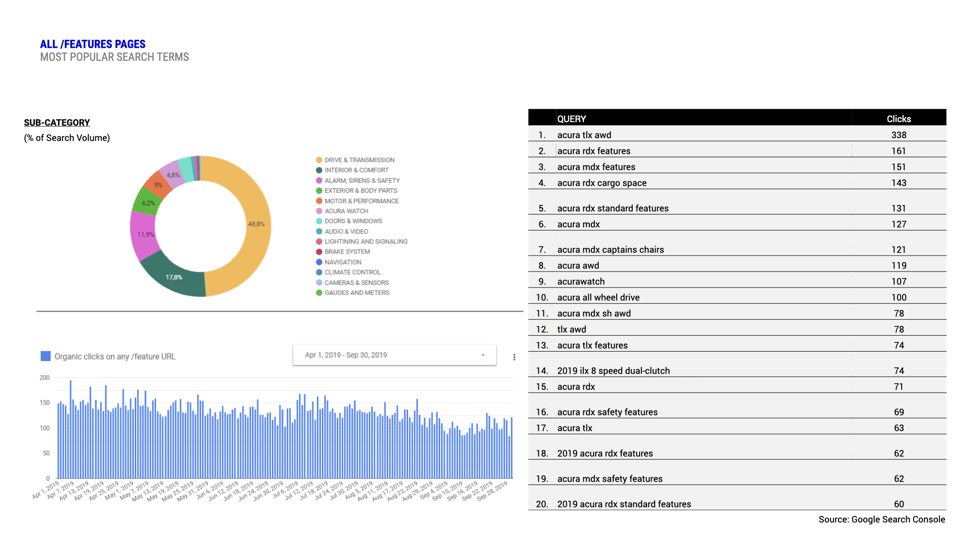
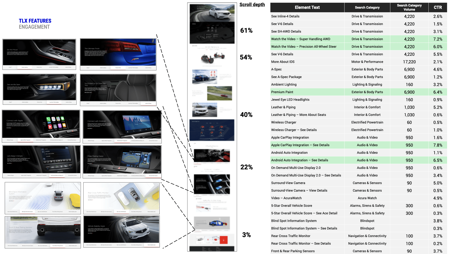
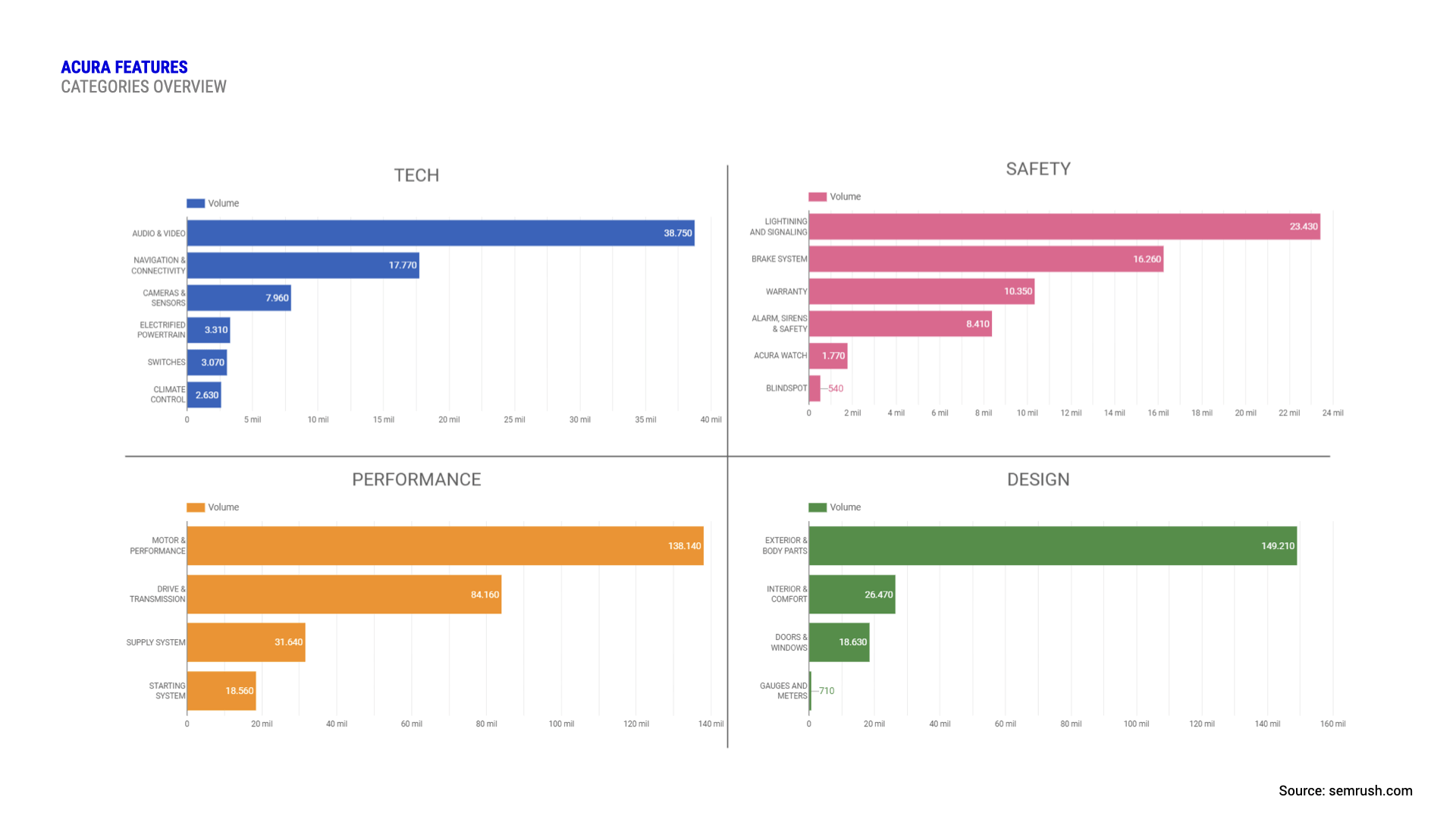
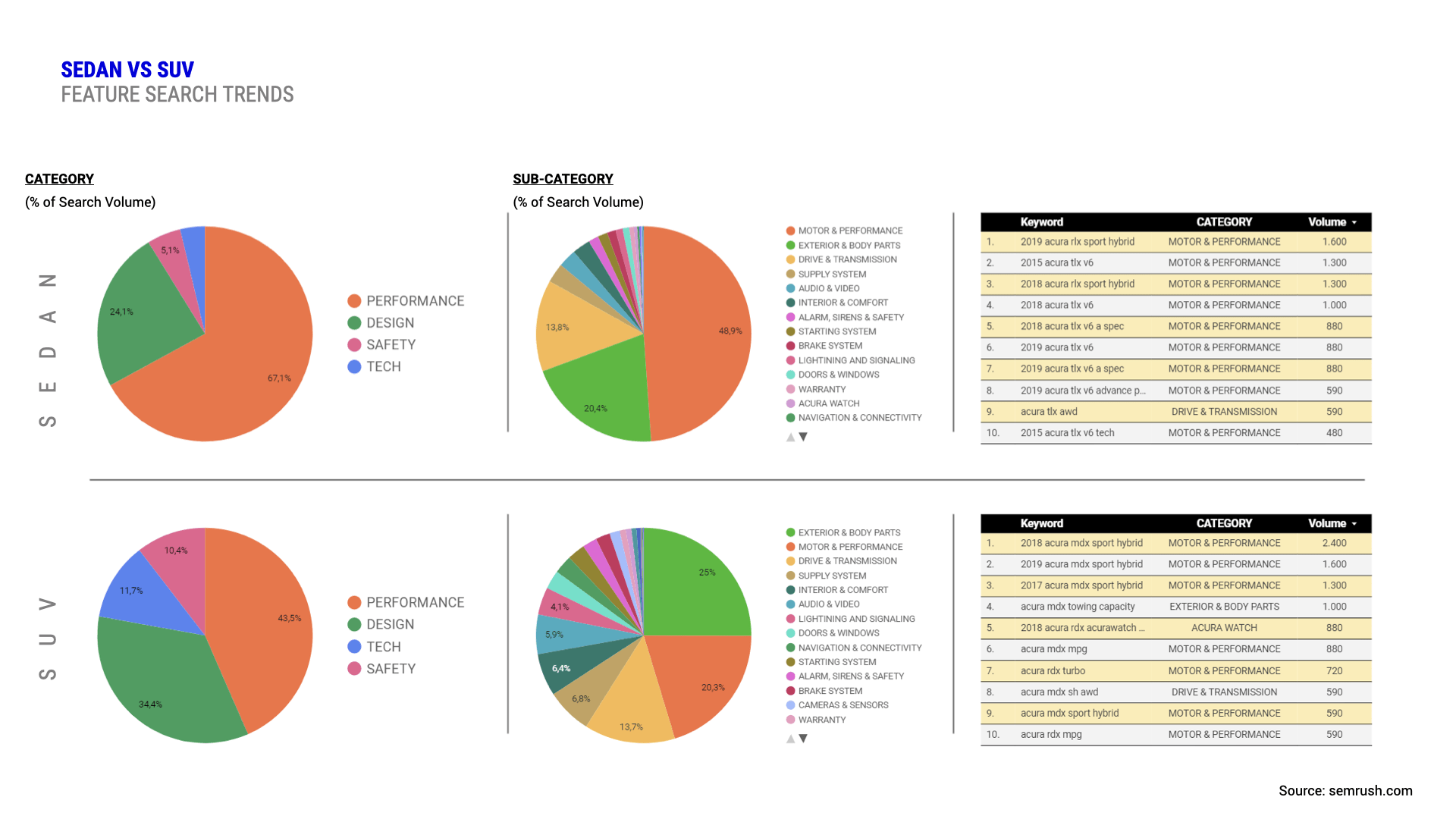
While the design team embraced a far-and-wide approach to generative exploration, our data and analytics team worked in parallel to conduct deeper initial market research, evaluate the performance of the current experience, discover search trends, and poll feature popularity for different vehicle models.
Data and analytics findings for feature popularity, search interest, and engagement
Some decisions that can be made with data are rather low-hanging fruit: keyword research and engagement metrics helped us decide what language speaks most effectively to customers or reprioritize certain modules in a straightforward manner. Design can really shine most where it meets the challenge of using quantitative findings contextually in tandem with human-centered thinking to shape a compelling narrative that truly captures customer interest. Examining data with a wider perspective encouraged us to add audio, connectivity, and safety to the list of categories that emerged from our exploration phase's sorting exercises and focus on how exactly we wanted to communicate their value to customers. Focusing on the human element allowed us to recognize that most people's last car purchase was also the most expensive integrated computer purchase of their lifetime and that vehicle audio is most people's peak listening experience. There was an opportunity to provide reassurance here with features like Apple CarPlay and Android Auto integrations but also introduce surprise with new technological capability like Amazon Key in-car delivery.
Despite its lesser popularity as an explicitly categorized feature, we recognized a focus on interior and comfort as a narrative gateway to those experiences since it constitutes the ambiance in which they take place. For SUVs, we could focus on utility by demonstrating interior configurability and for sedans, we could steer toward our brand differentiation goals. We could lean into sedan shoppers' elevated interest in performance here with the understanding that it's not just a measurement—it's an aesthetic and the primary brand pillar for Acura. There was an opportunity to showcase additional package features like ambient lighting or highlights and detailing that complement and enhance the vehicle and its experiences in ways unique to Acura and its design sensibilities to make the car look and feel like a performance vehicle.
Wireframes, Specs, and Prototypes
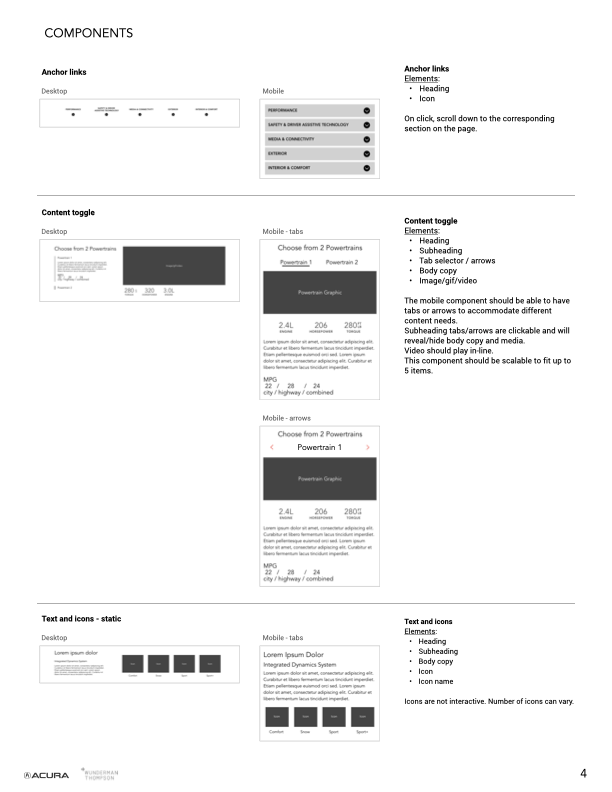
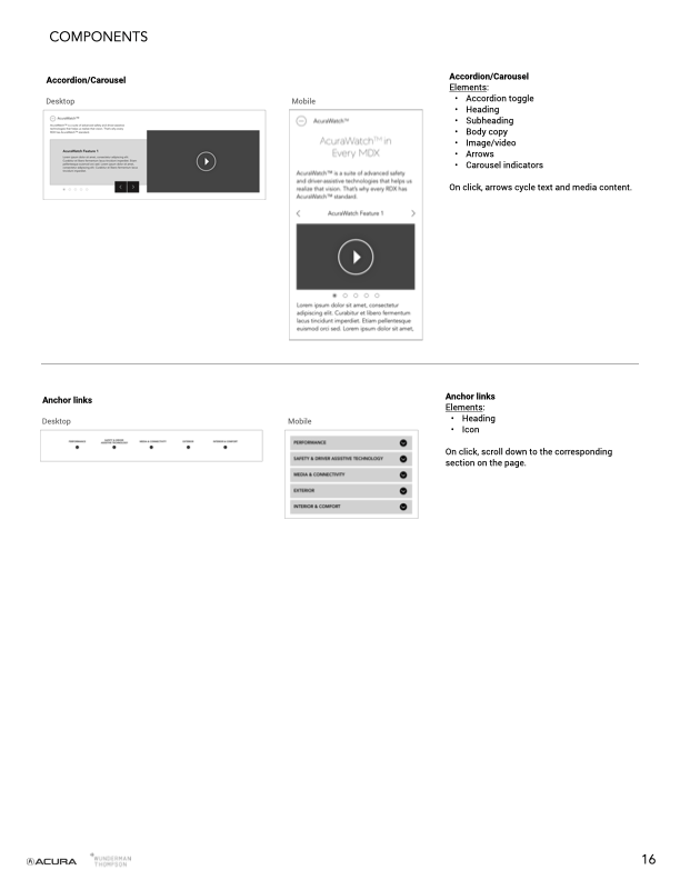
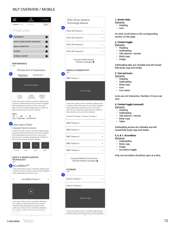
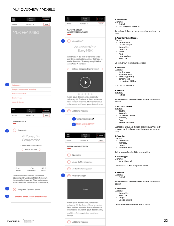
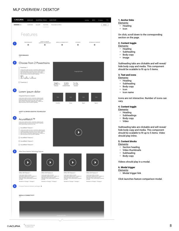
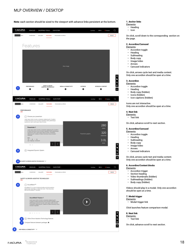
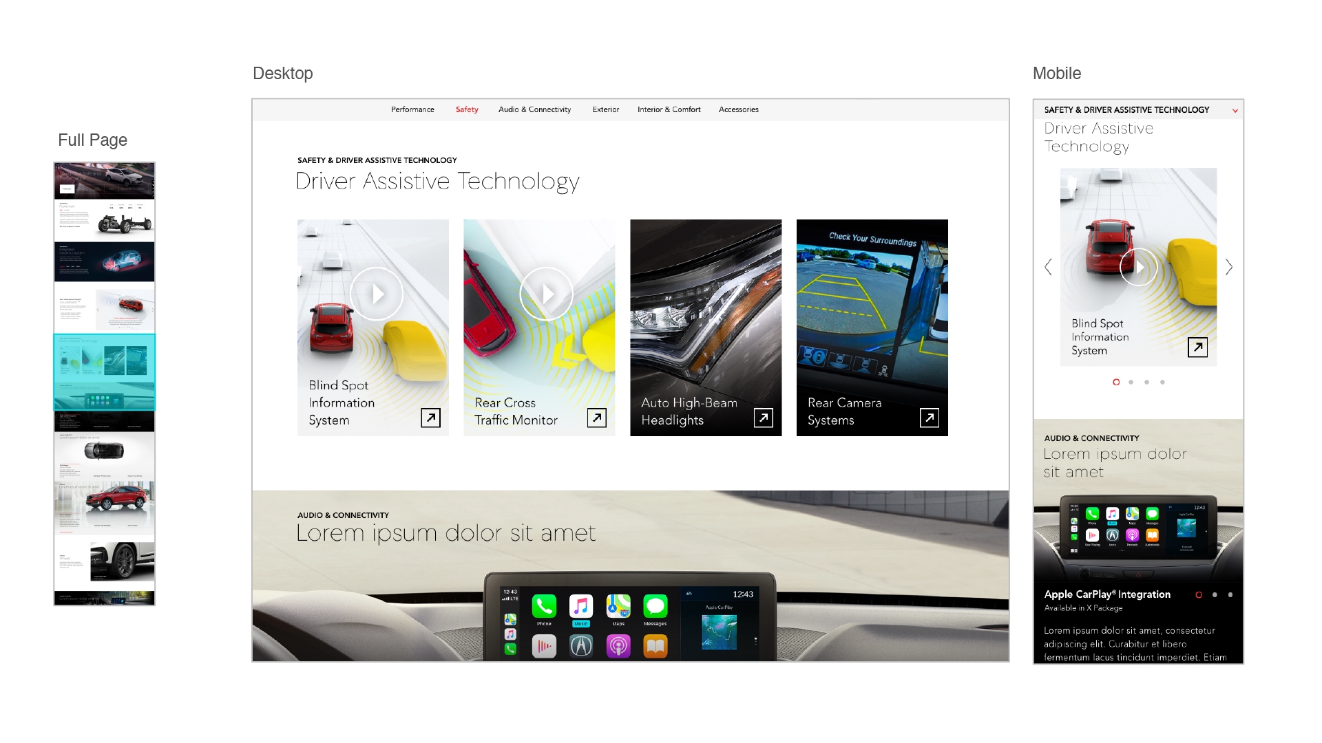
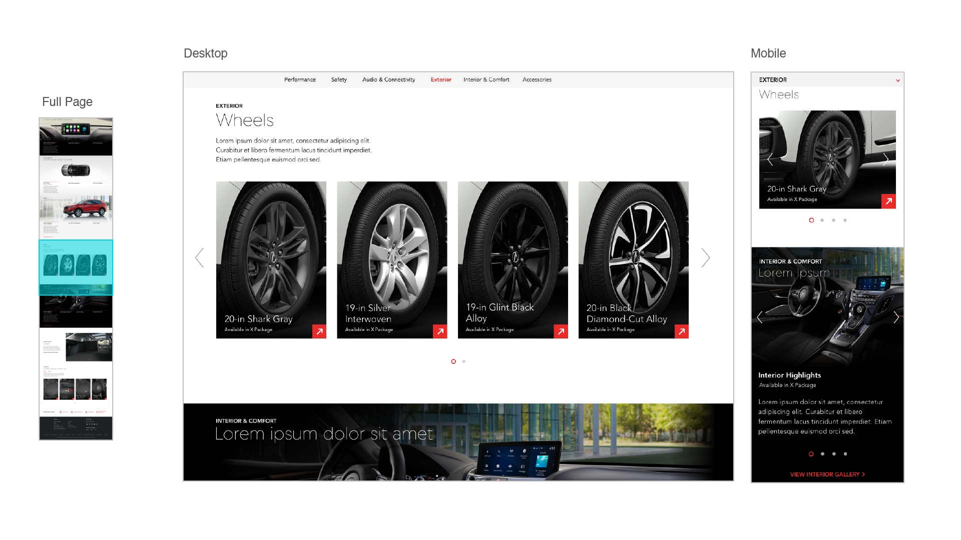
Granular data on which features proved popular in which contexts provided helpful directionality when it came time for the design team to prune concepts and align on more focused treatments that could address customer interests and resonate with what people want most in a new vehicle. I authored the initial functional specification document by outlining the appearance and behavior of various components in mobile and desktop viewports and creating structural narratives that explored how different modules could work to support customer understanding of each feature category.
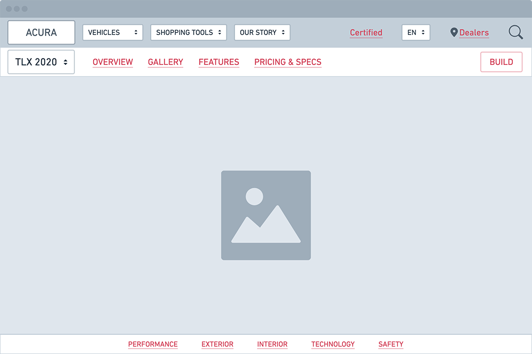
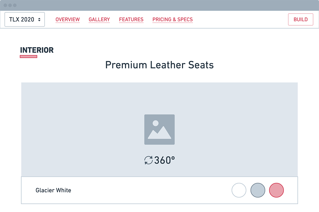
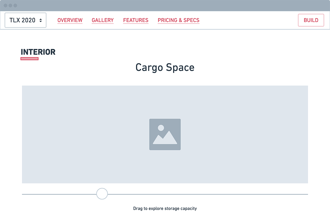
Early wireframes and functional specifications for components, mobile, and desktop
The team landed on two principal design directions that we'd iteratively expand and refine in tandem with further research and feedback cycles throughout the remainder of the project. After achieving alignment on the initial variations we'd be presenting to Acura, I prototyped some basic interactions and flows to get a rudimentary feel for how the various components in our system might work together to provide affordances for the discovery and exploration of vehicle features.
Low-fidelity interaction prototype
User Research
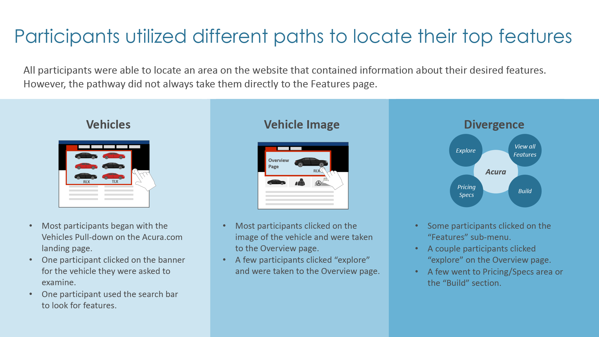
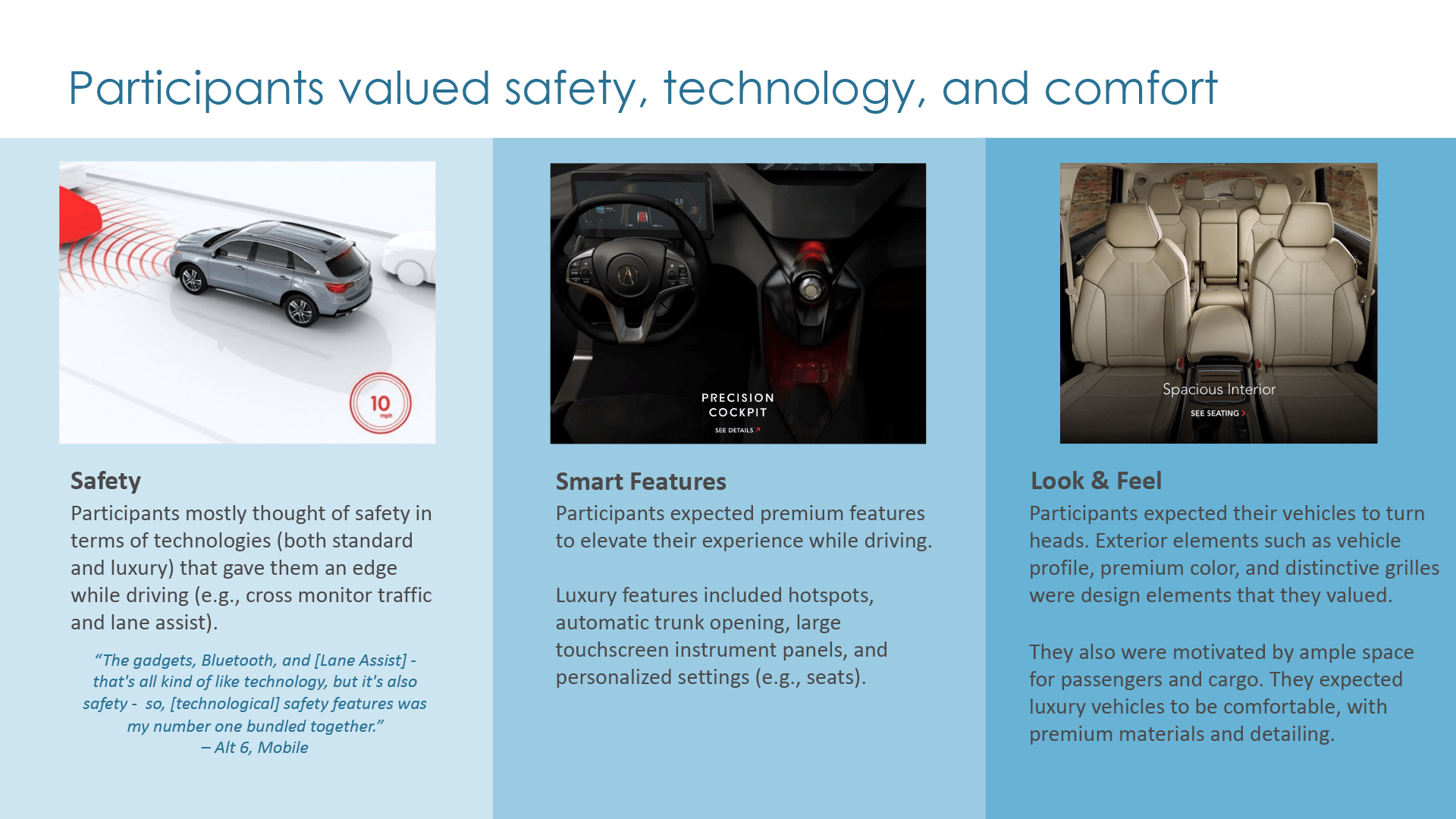
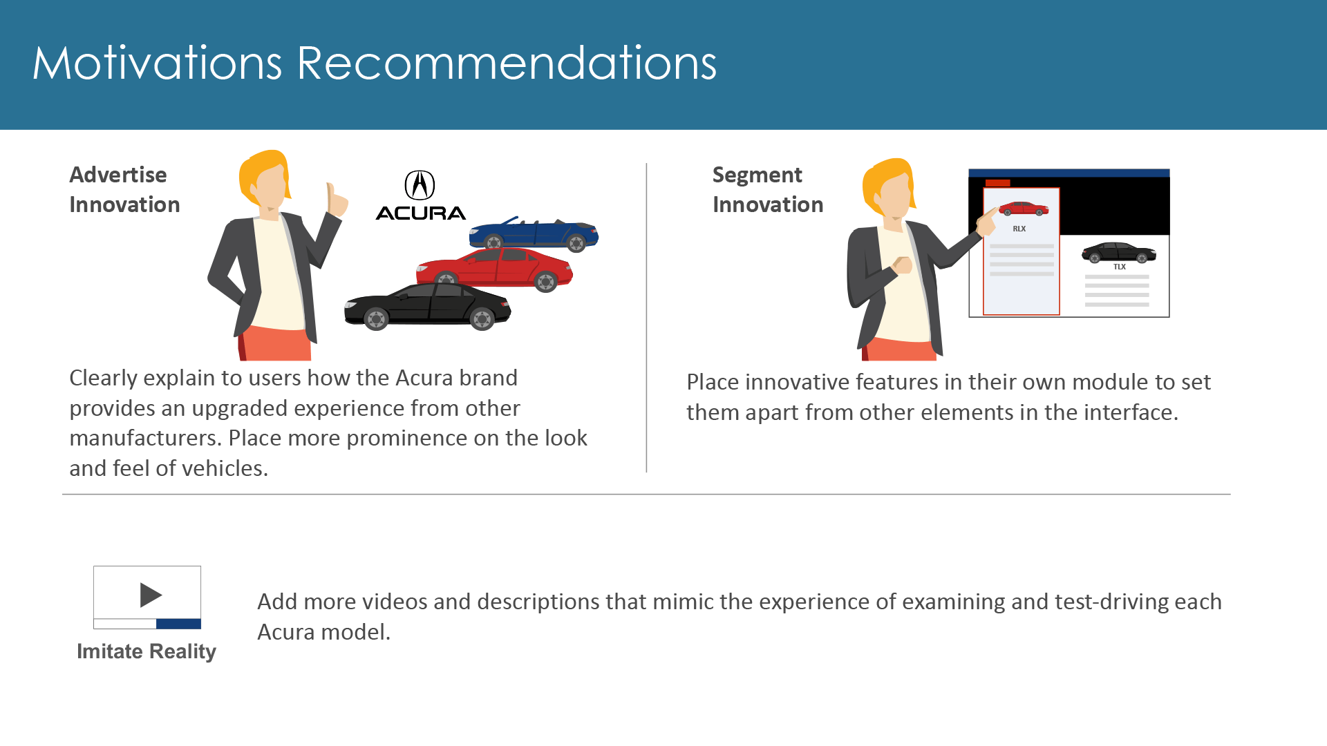
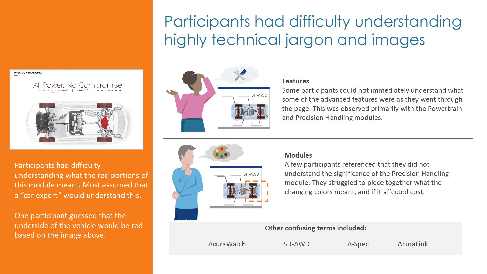
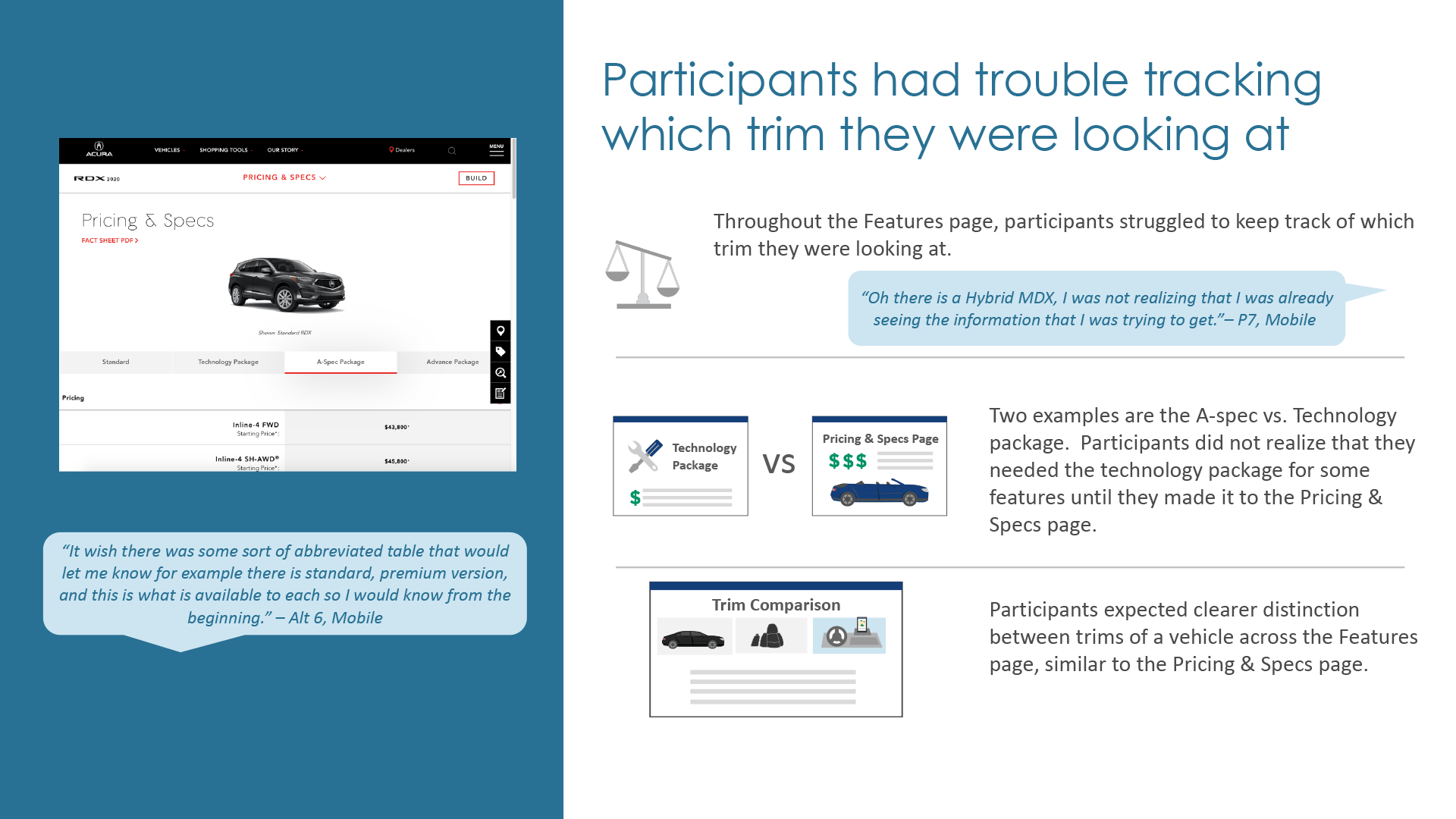
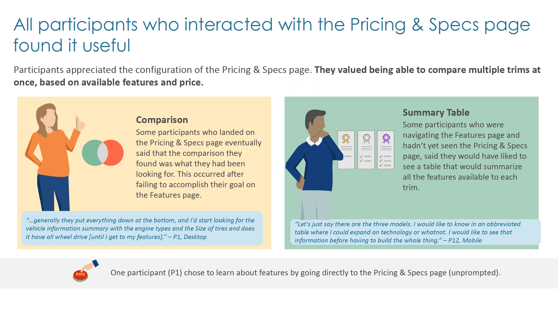
We ran intercept surveys on the live experience and commissioned an independent user research study to dig deeper into the pain points identified in earlier market research and gain further insight into how customers responded to those issues in real time. 12 participants were selected for the study with a 50-50 mobile-desktop split. Each completed a 60-minute session consisting of a one-on-one interview, one usability and one discovery task, and a system usability scale questionnaire. Research findings yielded more recommendations with increased specificity and provided the context the design team needed to further refine experience details to meet underlying user needs.
Research insights and recommendations on pathing, valued features, tone, and motives
High-Fidelity Designs
Armed with a superior understanding of the pain points users were facing, the design team refined functional specifications for components before transitioning toward realizing concepts in higher fidelity. We were aided in this endeavor by new model year photography and CGI assets from Acura as well as the output from our in-house art direction and production team that shot on location.
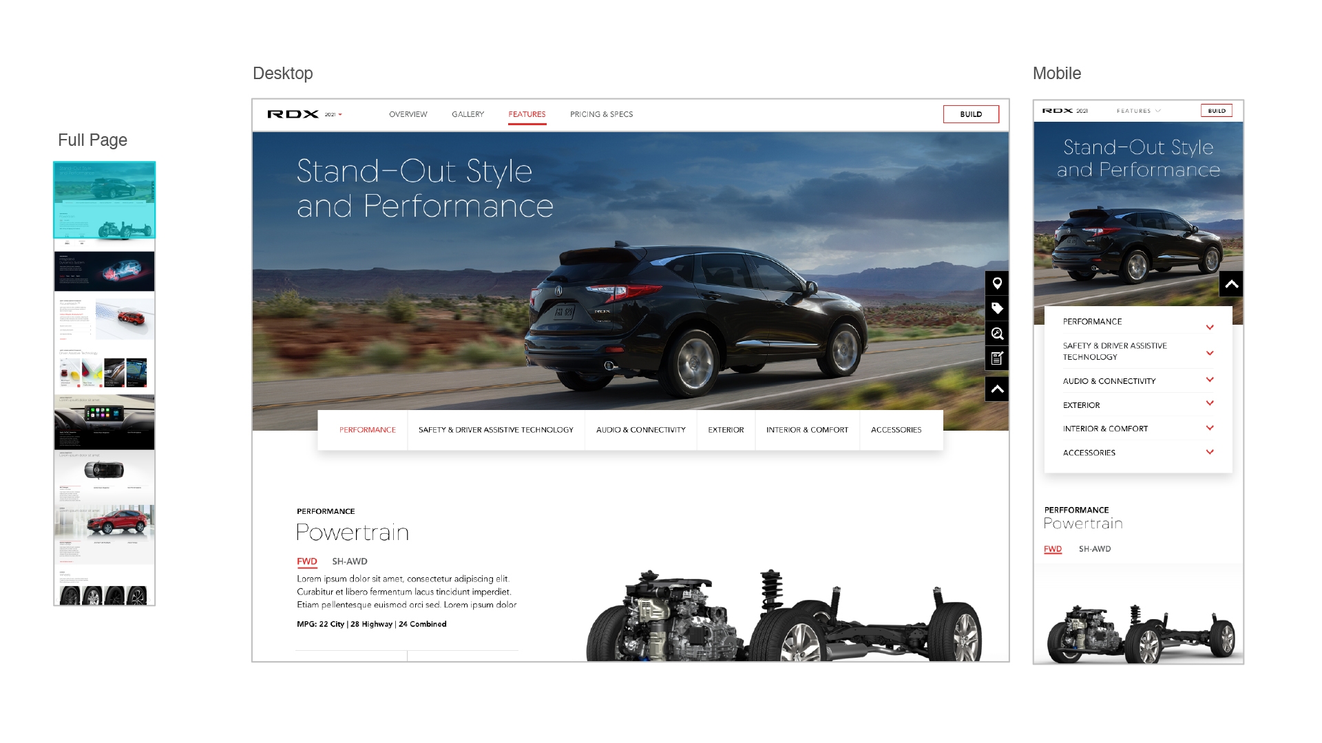
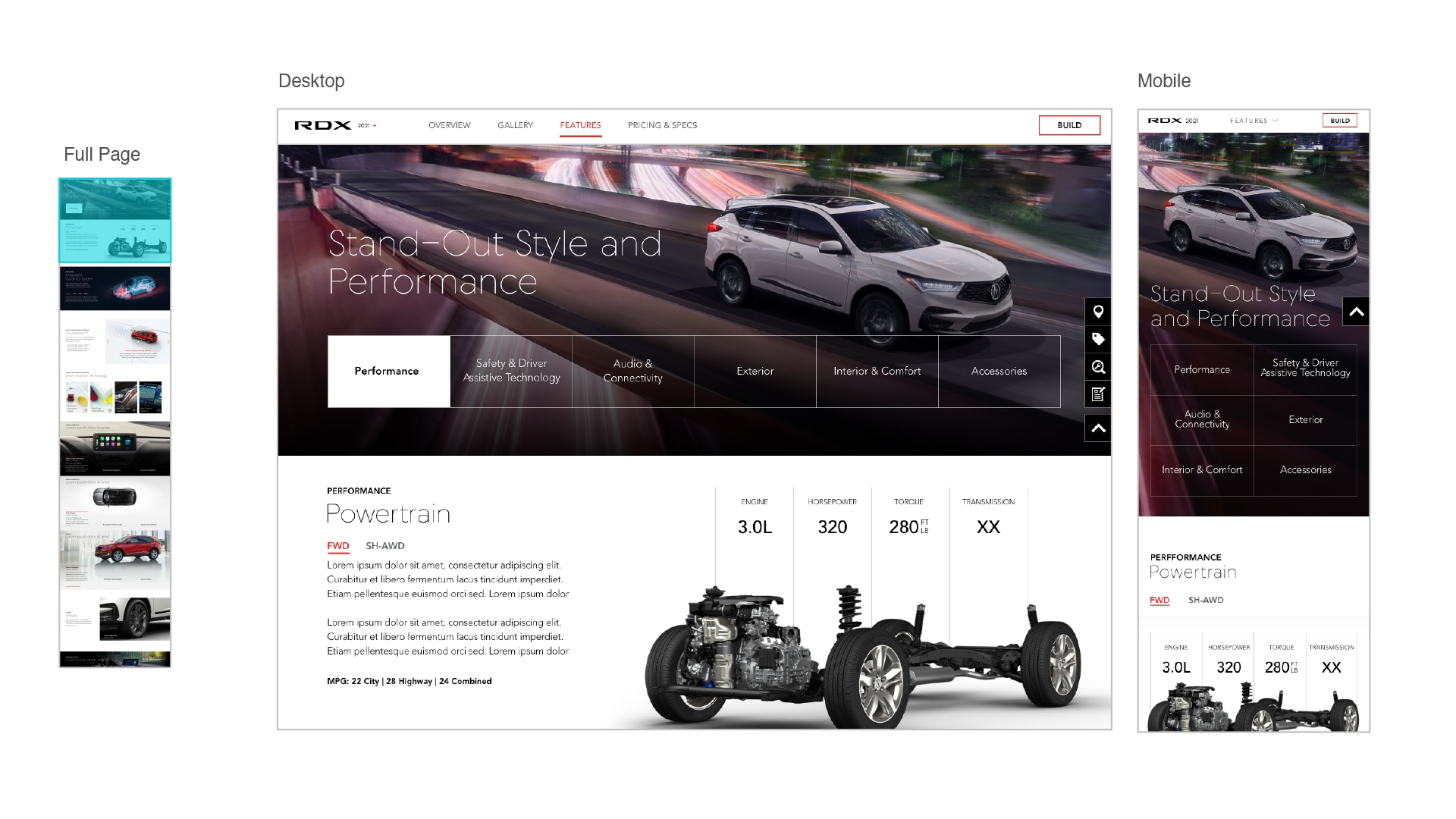
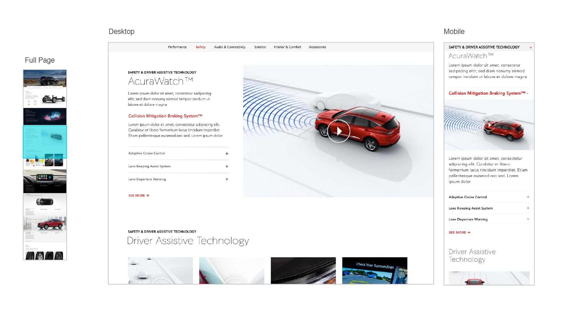
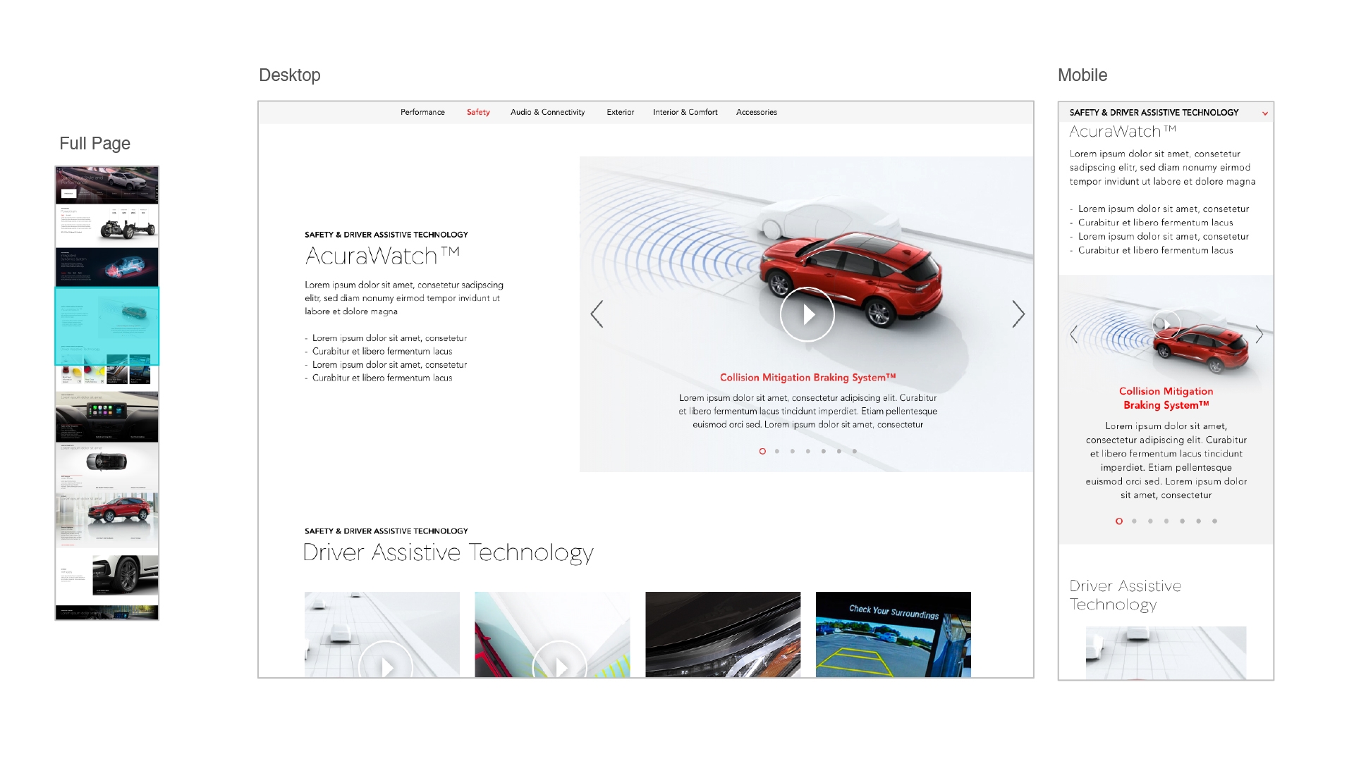
High-fidelity mobile and desktop mockups from both design concepts
While we zeroed in on a refined vision for elements, compositon, and narrative structure, we once again sought a generative and exploratory approach to the finer details of the experience's look and feel. I prototyped several variations of interactions for both concepts to give our stakeholders an extensive menu of options that could make the experience feel exciting and real for them. We hosted clients at the office for a day-long workshop where they had hands-on time with prototypes and engaged in exercises to validate our interpretations of user research findings and ensure alignment on our strategies for feature presentation, comparative affordances, and more solutions.
High-fidelity mobile interaction prototypes
High-fidelity desktop interaction prototypes
Outcome
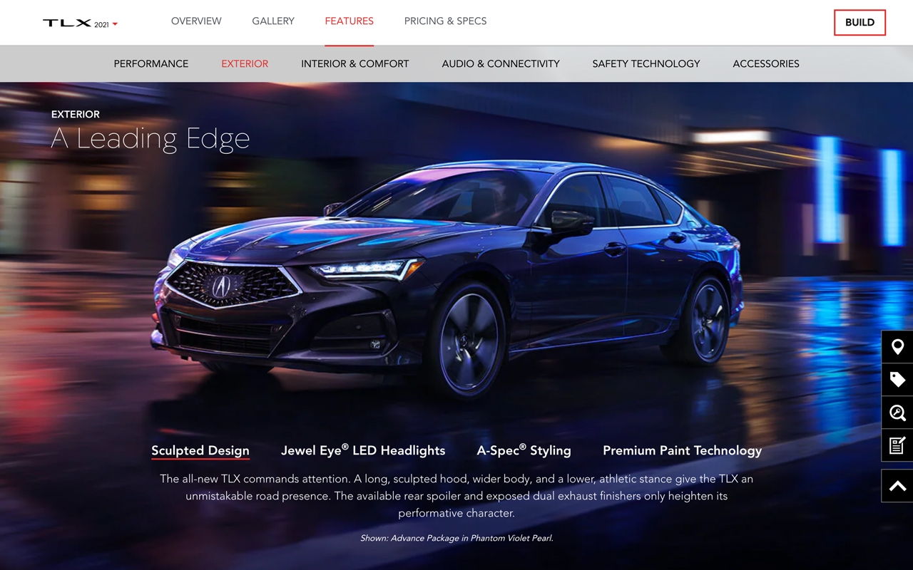
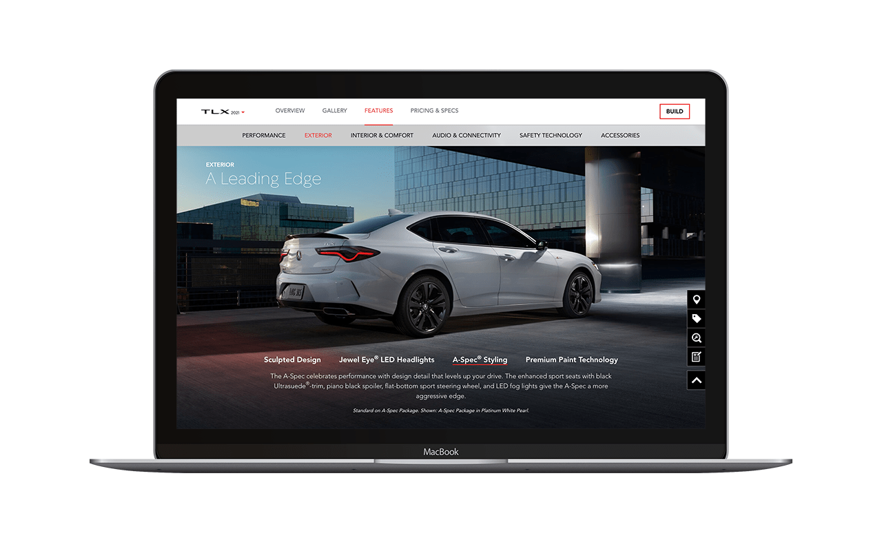
The team arrived at final designs and specifications after a few more iteration and feedback cycles with stakeholders. The all new features design debuted within the 2021 TLX Future Vehicles experience in May of 2020. The TLX is a core model for the brand and the unveil was accentuated by the return of the Type S high-performance variant after a decade-long hiatus. The model was originally slated for a reveal at the New York International Auto Show, but Acura pivoted to an entirely digital launch strategy because of the show's cancellation due to the COVID-19 pandemic. Without a showroom, press events, and test drives, the website became a far more consequential fulcrum for discovery, promotion, consideration, and eventually orders when the TLX went on sale in the fall.
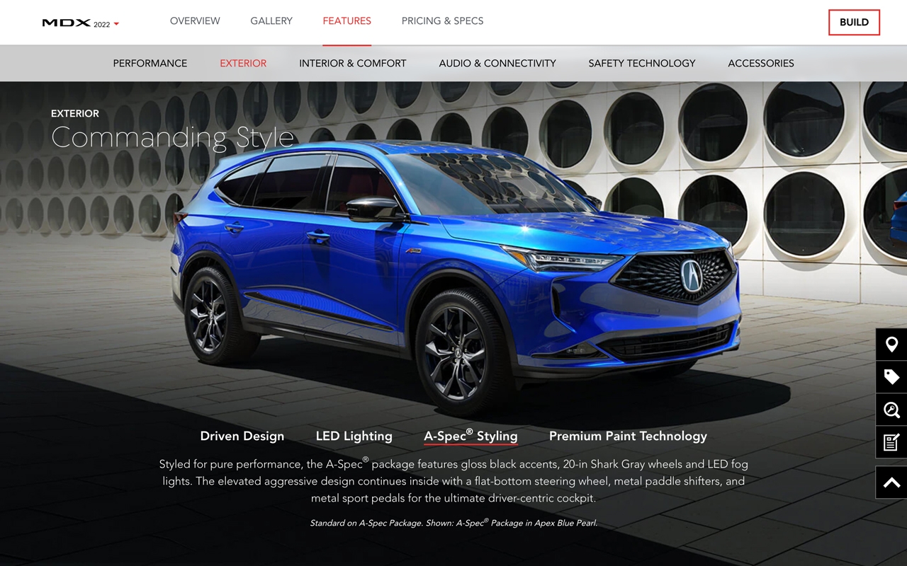
A key consideration of the redesign was also the adaptability of the experience to other models that had different distributions of feature popularity and occupied a different niche for Acura's customers. The features redesign was reprised within the 2022 MDX experience to speak to the premium performance and technology features of the SUV. The new MDX debuted in January of 2021 and went on sale in February.
• 1.28 million monthly visits following September MY21 TLX launch
• 220% increase in visits during first 3 months compared to MY20 TLX
• 294% increase in web-generated leads following experience launch
• 10% increase in submitted quote requests over 3 months
Redesigned features experiences for 2021 TLX and 2022 MDX on desktop and mobile
