Microsoft Education Blog
Redesign of the Microsoft Education Blog web experience
Role: UX design
Summary
I led an end-to-end redesign of the Microsoft Education Blog during the COVID-19 pandemic for Wunderman Thompson. The project took place during a highly dynamic time for the education segment that saw record web traffic as educators, administrators, and other audiences increasingly sought information online to navigate novel challenges related to remote and hybrid education.
Problem
How can we enhance the user experience of the blog with an audience-driven approach that refines its purpose, simplifies its content and navigation, and supports its connections to other Microsoft web properties (especially in Education)?
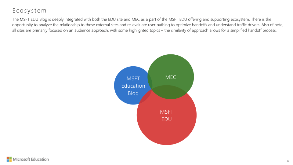
The brief was shaped by a discovery process that uncovered opportunities to improve design and content layout, optimize taxonomies, enhance tagging, streamline pathing, align the content update process with business goals, and capitalize on internal and external search optimization to ultimately deliver a more efficient and engaging platform for Microsoft Education's audience of educators, school leaders, and IT professionals.
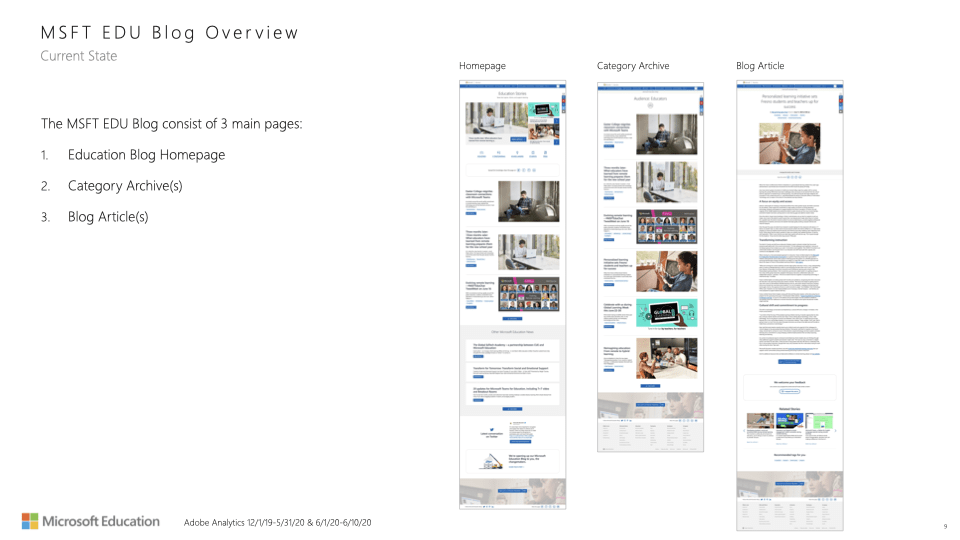
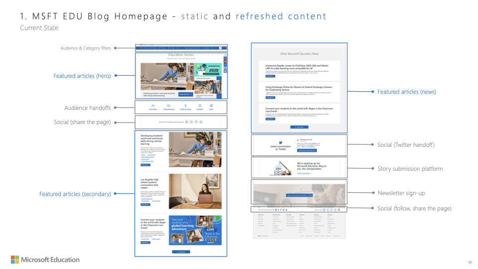
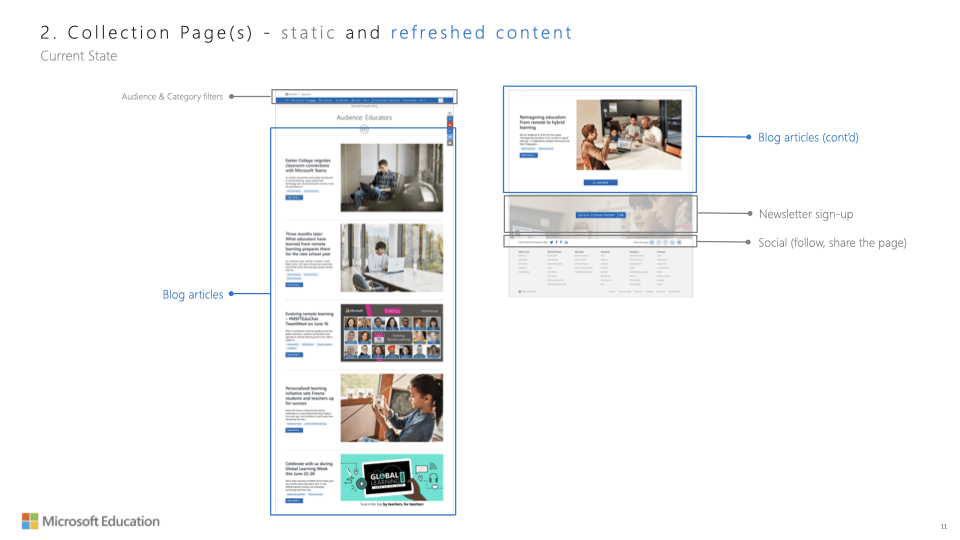
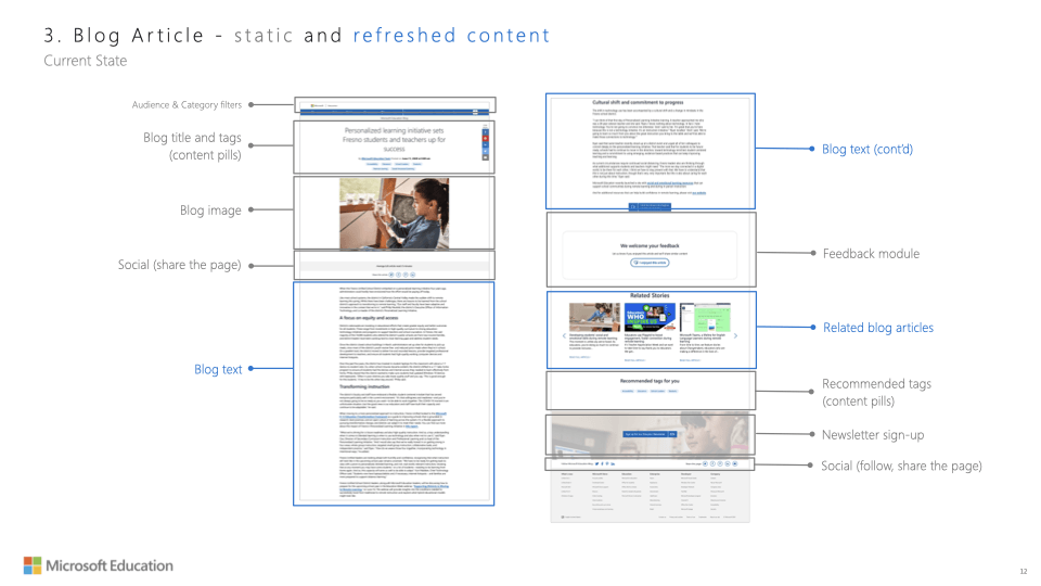
Design brief excerpts: current experience and web property ecosystem overviews
Wireframes
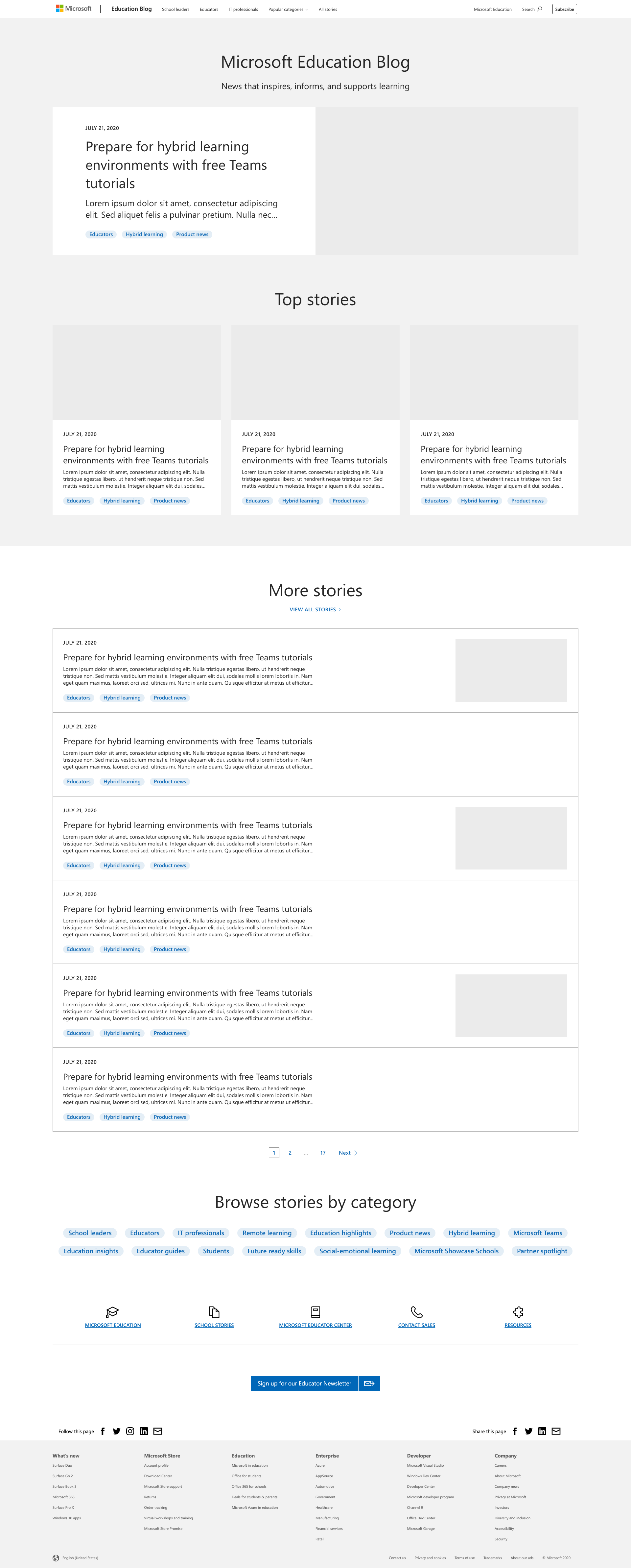
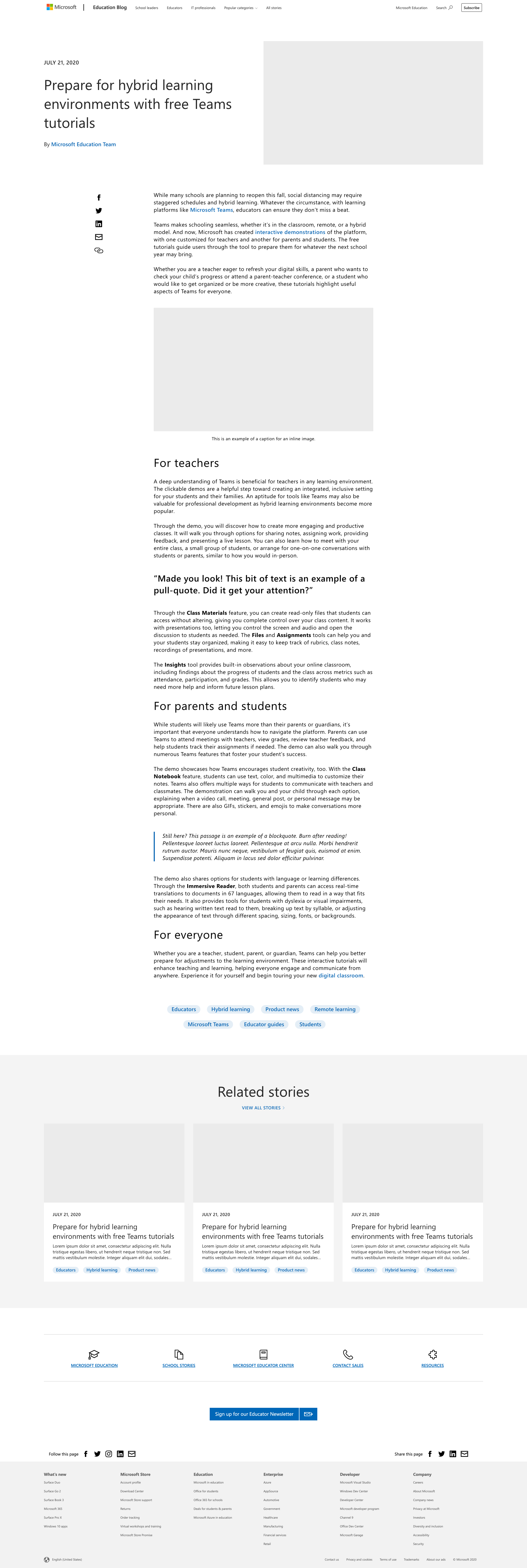
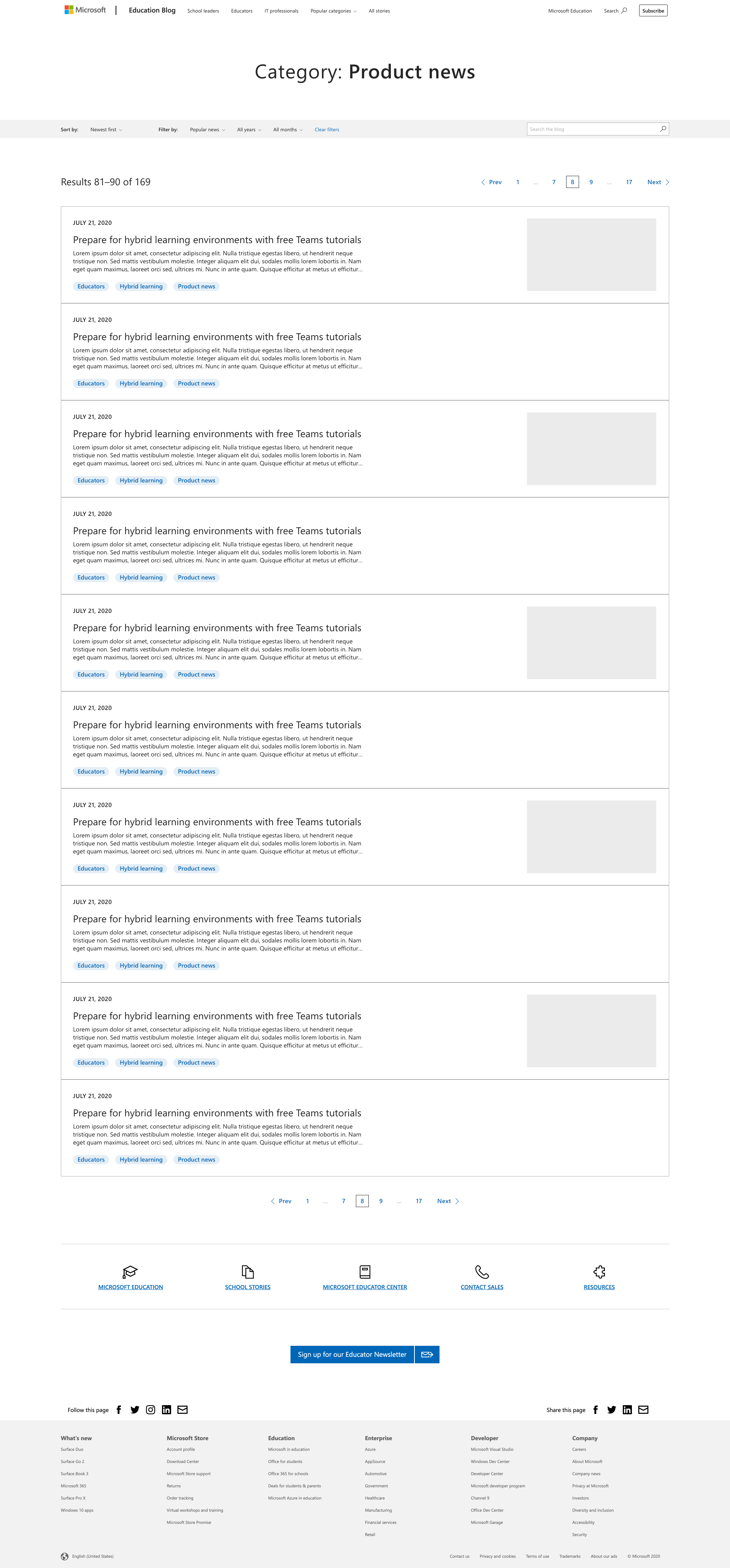
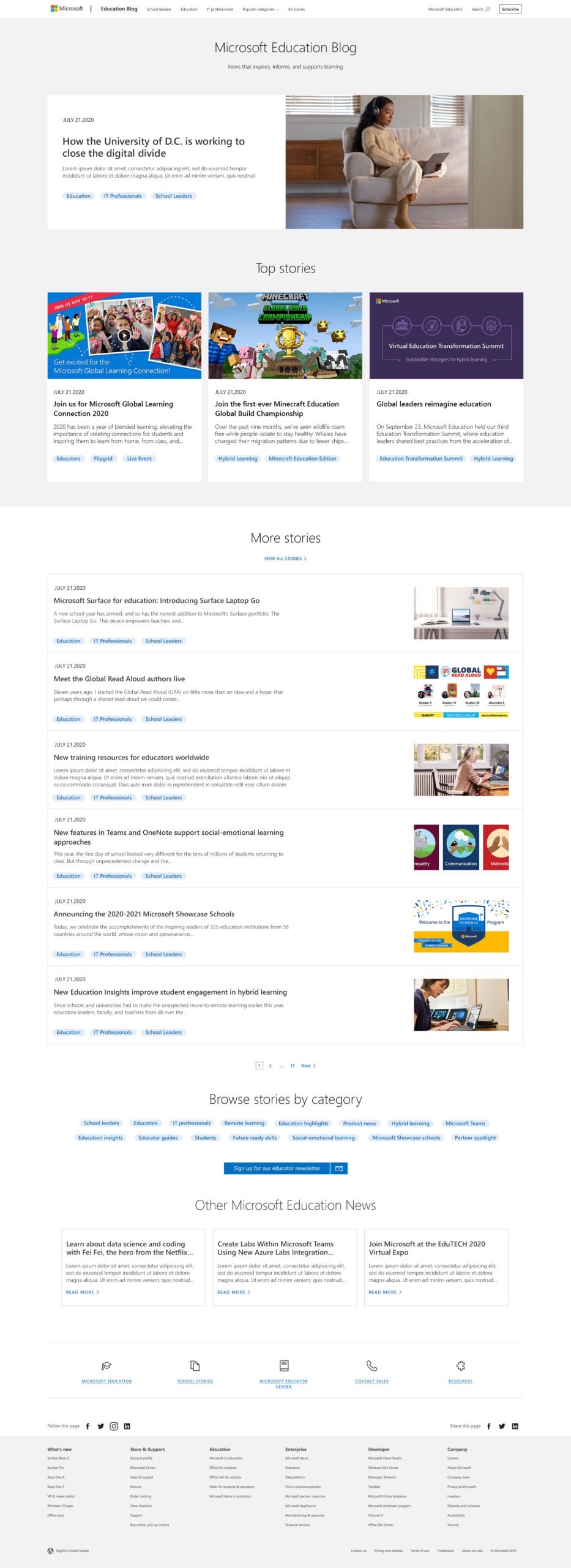
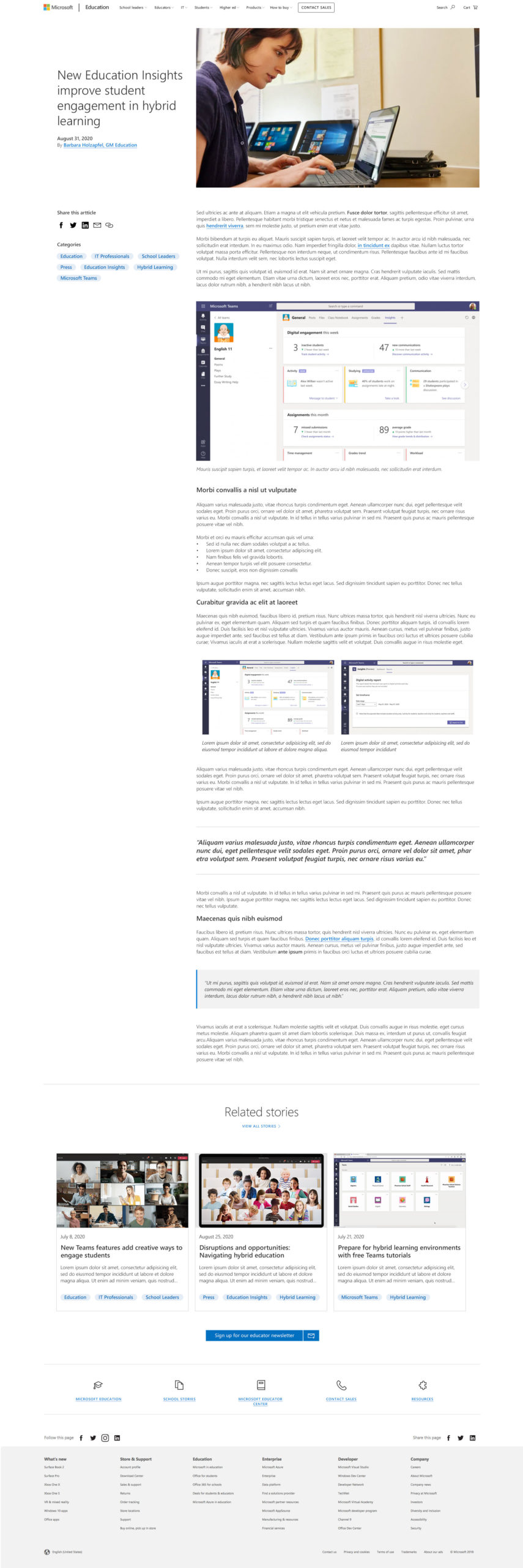
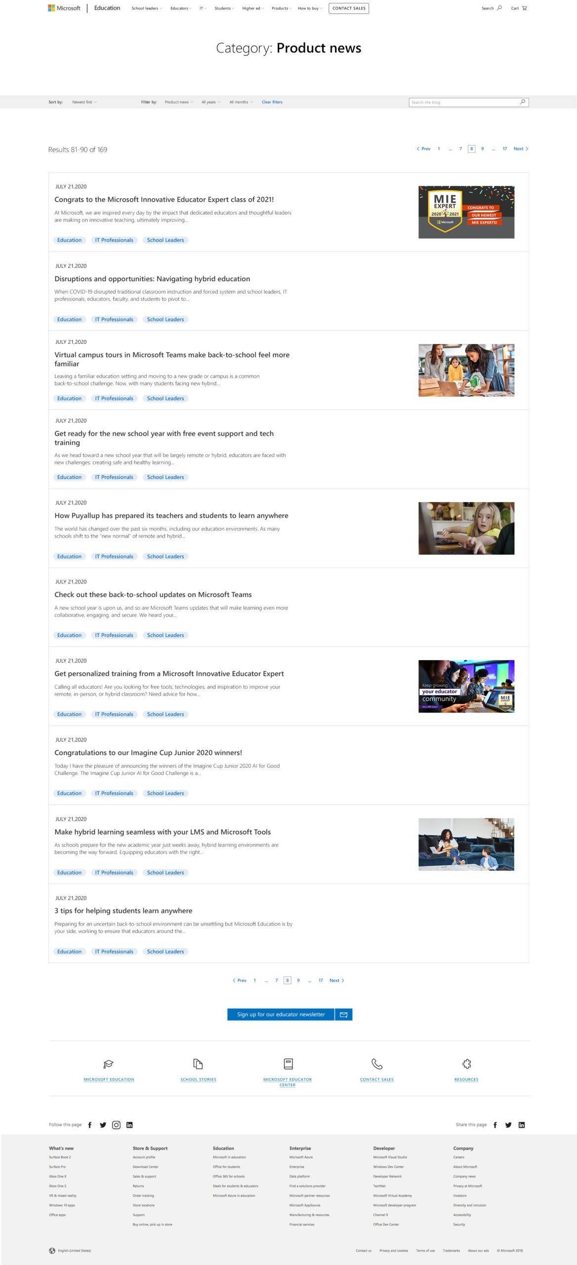
In the wireframing phase, I prioritized creating a visually intuitive and engaging framework for the Microsoft Education Blog’s diverse audience. I focused on rich previews to give users a compelling snapshot of content, designed layouts for articles both with and without images, and added multiple avenues for category-based navigation to enable easy topic discovery. Clear typographic and layout hierarchies were established to enhance readability and user engagement. Additionally, I integrated social sharing features and robust search and filtering capabilities to help users efficiently locate specific information. These wireframes laid the groundwork for a user-centric design that balanced the goals of each audience.
Wireframes: blog home, article layout, and category archive
Prototype
After some iteration on the wireframes, I stitched them into prototype flows to help stakeholders better understand how users would navigate the sitemap through multiple avenues and interact with features like search.
Prototype demonstrating multiple navigation avenues and interactions
High-Fidelity Designs
I worked with other designers on my team to finalize details of the blog's design in higher fidelity to give stakeholders a richer representation of the final product. We focused on layout dimensions, alternate layouts for different kinds of blog content, typographic style, and other fine details to bring the design home.
Designs: blog home, article layout, and category archive
Documentation
I developed a static website as a documentation resource for the stakeholders of the blog. It acts as a functional specification for all of the components utilized across the sitemap, explaining their characteristics and behavior and in part acting as a style guide. It also breaks down each page layout in the sitemap to explain its component composition. This went beyond the scope of my work as a UX Designer, but it proved extraordinarily helpful in decreasing implementation costs for the client. Their delight drove home the value of going the extra mile, taking ownership, and delivering best-in-class results regardless of my explicit role or title.
Documentation website: component reference and functional specification
Outcome
The relaunch of the Microsoft Education Blog saw positive reception from multiple audience segments whose needs were carefully considered during the discovery and design processes. Educators, administrators, IT professionals especially found the new taxonomy treatments helpful for surfacing the resources that they needed to navigate the mercurial nature of remote and hybrid education during the pandemic. The redesign of the blog worked in tandem with my efforts on the core Microsoft Education website and other web properties in the Microsoft Education ecosystem to assist and assure parents of students as they stepped deeper into their children's education in the midst of the pandemic. The blog saw record traffic and engagement during this time with a 127% increase in unique visitors for the following quarter and a significant increase in repeat visits.
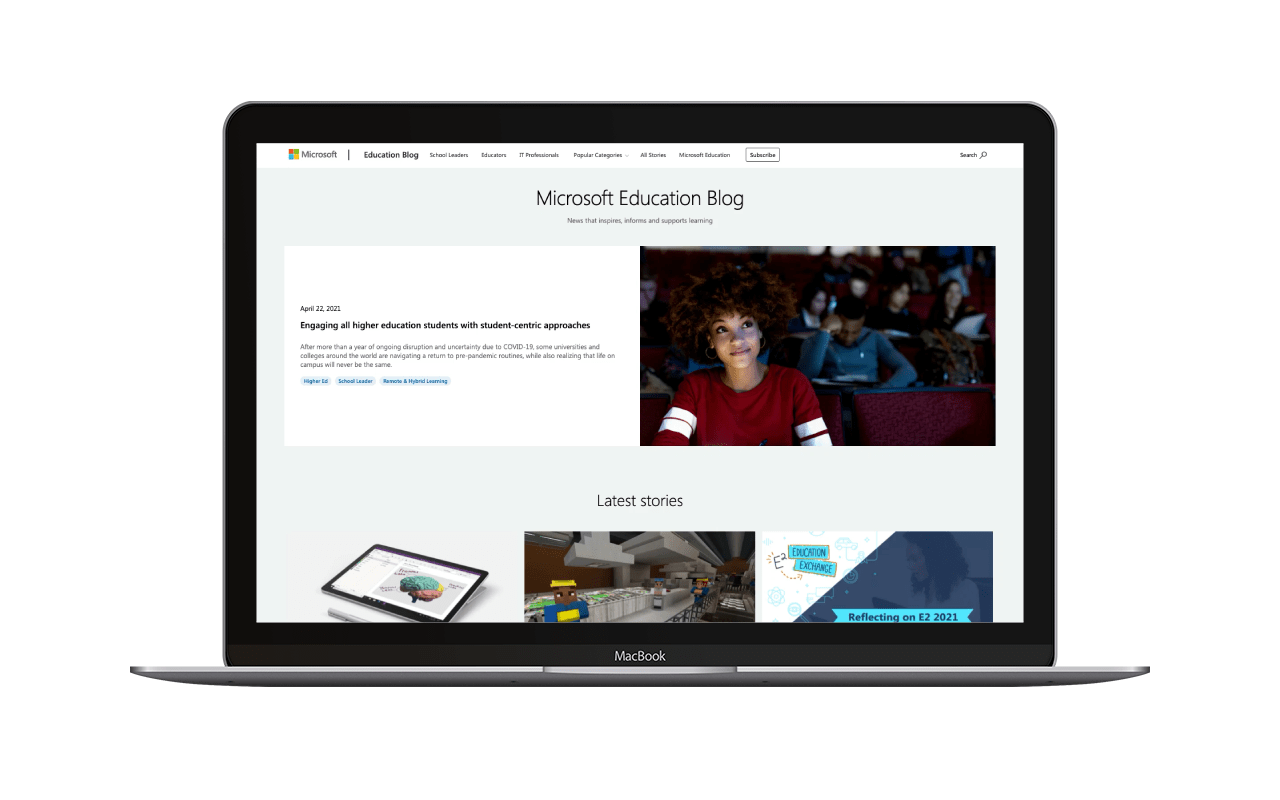
Redesigned Microsoft Education Blog
