Q&A: How can digital designers mix RGB colors more effectively?

Q&A is a column in which I’ll post long-form answers to thought-provoking questions. This particular question was inspired by a thread in Designers Guild, a Facebook community that I moderate. Designers Guild consists of 10,000+ designers committed to discussing, learning, and growing together.
The question
Recently, pixel artist and game designer Slynyrd published a great blog post walking readers through a process for creating awesome pixel art color palettes. The tutorial focuses on selecting colors by manipulating HSB properties (hue, saturation, and brightness). This prompted a question about designers’ favorite ways to mix color.
The answer
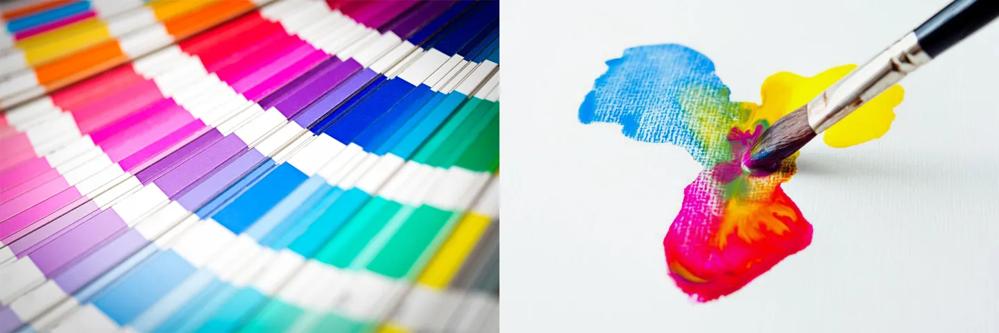
I’ve always found generating HSB swatches to be the most intuitive method for novice designers to make color selections. Generating a single swatch with the HSB scales feels the most analogous to picking out a swatch from a color book in real life: you basically choose the general color you want (hue) then filter down to find your swatch by selecting for finer attributes of that general color (saturation and brightness). These three properties of a color are what give the scale its name (HSB = hue, saturation, brightness).
However, over the last couple years, I’ve taken a liking to directly mixing RGB in many situations (especially when it comes to building out larger palettes). Instead of picking swatches from a color book, it’s more analogous to mixing paint in a palette (except that mixing in RGB is additive rather than subtractive, so it’s technically mixing light; more on this later). RGB is named for the three channels of light mixed to produce an onscreen color (RGB = red, green, blue).
Like a swatch book, HSB provides a great scale for finding a color. It can be useful for pinning down a match for the color you’ve seen in your head, on a screen, or in the real world. Like a painter’s palette, RGB provides a great space for mixing color. It can be used to create organic and harmonious relationships between two or more colors in a palette.
The main idea
To start mixing in RGB, think of each channel as a bucket of red, green, or blue paint. With 8 bits per channel, you have 256 levels of granularity for how much of that color you want to mix in; 255 is the whole bucket, 192 = three quarters, 128 = half bucket, 64 = quarter bucket, and so on. Once in the ballpark, you can adjust the mix by finer increments (e.g. 4 = 1/64 bucket).

What I like about this method: preserving the channel ratios across colors and finding ways to recombine and riff on them can create more natural color harmonies amongst all of the swatches that end up in my palette. There’s something poetic about building color palettes by using the parameters of the color space itself as mixing model. When I finally got comfortable with this method, it felt a little like when I first understood how to utilize the grid for layouts; you’re not just picking a set of colors that look good, you’re outlining a system that encourages discretionary relationships in order to arrive at it.

By simply swapping a full blue channel for a red one, we’ve arrived at a yellow that complements the cerulean quite nicely.
Comparison with HSB
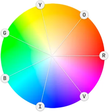
Comparatively, the same result can be attained in HSB by shifting the hue +210º (7/12) or -150º (-5/12). This exercise can often get a little more arbitrary for two main reasons:
-
Different hues are affected unequally by brightness and saturation shifts as a result of varying natural value and chroma (for example, at a given saturation and brightness we still perceive a yellow hue as brighter than a violet one). The perceptual distance between a pure hue and white for example can also vary depending on which hue you’re working with.
-
Spatially mapping the distance from red to magenta onto the 360º of a circle can make for a less-than-intuitive visualization of hues. If color stops were placed in regular intervals along this scale, some shifts in hue might appear greater than others even though the stops are equidistant. This is also a result of the varying natural value and chroma of each hue. The best way to visually estimate which degrees correspond to which hues in HSB is with the old mnemonic from science class for the colors of the visible light spectrum: Roy G. Biv (red, orange, yellow, green, blue, indigo, violet). Notice that this doesn’t map too cleanly onto the color wheel in even increments (blue and indigo are off the mark).
All that being said, mixing in HSB isn’t bad at all. Here’s a good primer on it. The rest of this answer will focus on the strengths of an RGB mixing process.
Additive vs. Subtractive Color
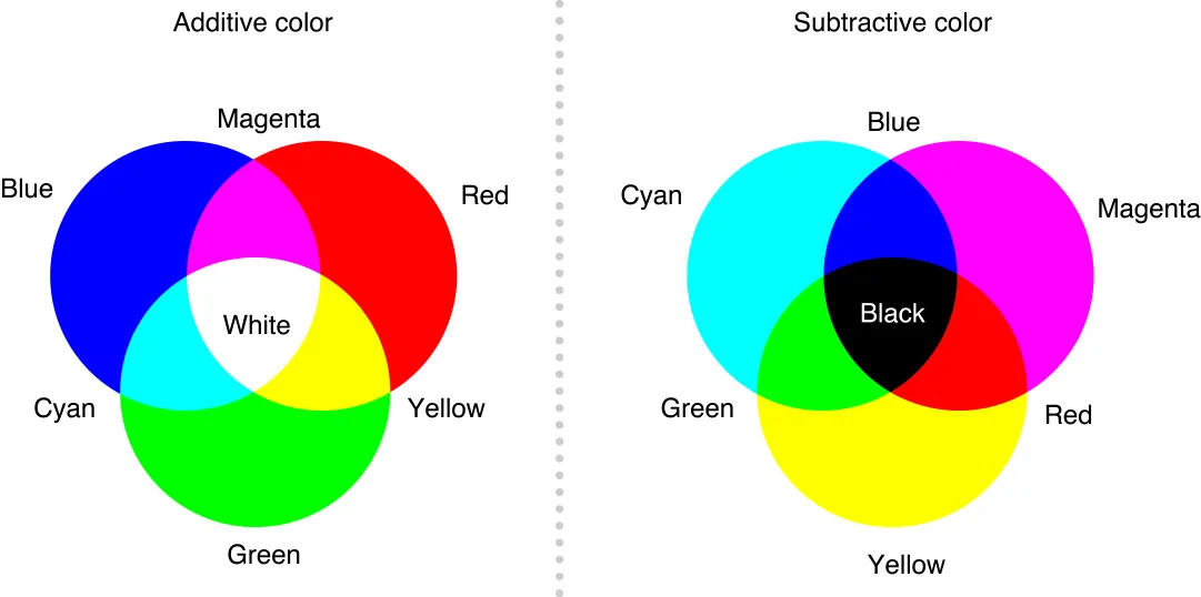
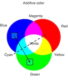
Something mentioned earlier was that RGB is additive rather than subtractive. What additive means is that adding more color information from any channel adds light to make brighter colors, ultimately resulting in white. You can see the summation of colors resulting in white in the color wheel graphic above as well as the diagram below. Compare this to subtractive mixing, where more color information subtracts light to make darker colors (ultimately black).
Example: Cool Gradient
Here’s an example of how I like to mix colors in RGB. We’ll begin a palette by making swatches to create this cool gradient:

Starting with blue
1. We know we want to start with a blue, so let’s just flood the blue channel all the way; RGB(0,0,255).
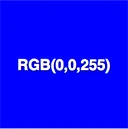
2. Good start, but it’s too dark and just too blue.
- We’d like a lighter color—remember that since RGB is additive, we can get that by adding color information to another channel.
- We’re going to be matching it with a greener hue, so it makes sense that the channel we add should be green.
- Looking back at the additive color diagram, mixing a full blue channel with a full green channel results in cyan. We want a lighter blue but not that light.
- We can add green in small amounts like mixing paint in to find a sweet spot. What if we split our channel (256 levels) into eighths (256/8 = 32)? That way, every time we add 32 levels to the green channel, it’s like moving 1/8 of the way from full blue to cyan.

That last iteration looks pretty good; blue, but not too dark and not too saturated. We also have a really clean ratio between channels: RGB(0,96,255) = 0:3:8 RGB ratio.
From blue to green
Now that we have a nice blue swatch, let’s get another concordant swatch going. Looking at our intended result, we want this one to be greener and a good bit brighter.
1. Let’s take care of greener first.
- Remember that our first color was predominantly blue, but had a little green added to move it towards cyan.
- Swapping the values for the G and B channels will get us a color that is equidistant from cyan, but predominantly green instead of blue.
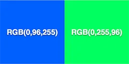
2. Lookin’ alright! These swatches already feel quite analogous in terms of brightness and saturation because they share similar channel ratios.
- Both swatches are equidistant from white in the color space since the total amount color in both swatches is equivalent. Both have 351 levels (96 + 255), but they’re just distributed inversely across the blue and green channels.
- The analogous nature of the colors is enforced by our logical use of the additive color chart. Essentially, the result of inverting the channel values was to reflect our original color across the cyan axis of the chart.
3. We’re off to a good start, but looking back at our intended result, we want a cooler palette that might call for a bluer green with a lighter touch; something closer to cyan but not quite.
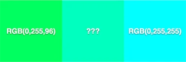
- We know that adding blue will get us there, but how much blue do we need? This is a good time to revisit the channel ratios.
- RGB(0,255,96) = 0:8:3 RGB ratio… what if we just mixed in double the amount of blue? This would get us a 0:8:6 ratio — not all the way to cyan but enough to cool our green down.
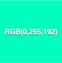
Looks like the sweet spot: a nice, strong aquamarine with a 0:8:6 RGB ratio. The ratio keeps our channels in 8 parts and plays really nicely with our other color’s 0:3:8 ratio.

From this point, we can shuffle the ratios even more to discover additional harmonious swatches inside the spectrum we’ve just established. We can make more minute adjustments using the same logic of splitting the channel levels into smaller fractions. We can bring in some of the starting blues from before for dark swatches, or even start incorporating the red channel into our existing ratios to get more contrasting colors. There are a lot of places to go, but hopefully, this example illustrates the thinking behind building more organic color relationships in the RGB color space.

How to see hexadecimal colors in your head
I made a 2-minute YouTube tutorial for a neat trick to visualize hexadecimal triplets that abridges some information found in the rest of the article. You can use this method as a practical shortcut in your work or as a cool party trick.
Hexadecimal colors
An additional bonus of mixing directly in the RGB color space is that we can garner a more intuitive understanding of its hexadecimal representations. Because a color’s hexadecimal representation (e.g. #0060FF) maps to its RGB values, mixing in RGB can gradually acquaint us more with these hex codes up to the point where we’re even mixing colors directly in hex. Here’s how to convert a hexadecimal color to its decimal RGB values:
1. Split your hex number into 3 groups of 2 characters.
- e.g. #0060FF = 00 | 60 | FF
- Each group now represents the R, G, or B channel respectively
2. Keep in mind that even the letters here are digits.
- 00 in the red channel means 0 red… simple enough
- But FF = 255? What?
- We’re used to digits in a decimal system. Dec = 10; 10 digits (0–9).
- Hex = 6 and dec = 10; hexadecimal uses 16 digits (0–F).
- We already know how to count from 0–9, but in hexadecimal, we just keep counting with letters (A = 10, B = 11, …, F = 15). Just imagine the letters as a single-digit representation of what would ordinarily be a number from 10–15 in our common decimal system.

3. To convert your hex number to the decimal value for the channel:
- Take the digit in the “tens” place (really the “sixteens” place in hex) and multiply it by 16 (or 16¹).
- Then take the digit in the “ones” place [and multiply it by 1 (or 16⁰)].
- Add the two together to get your decimal value.
Conversion example
Converting #0060FF to RGB:
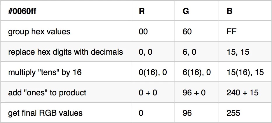
#0060FF = RGB(0,96,255)
You can reverse this process by dividing (Euclidean division) your decimal RGB value by 16. The quotient goes in the “tens” place of the hex number and the remainder goes in the “ones” place.
Converting RGB(0,96,255) to hexadecimal:
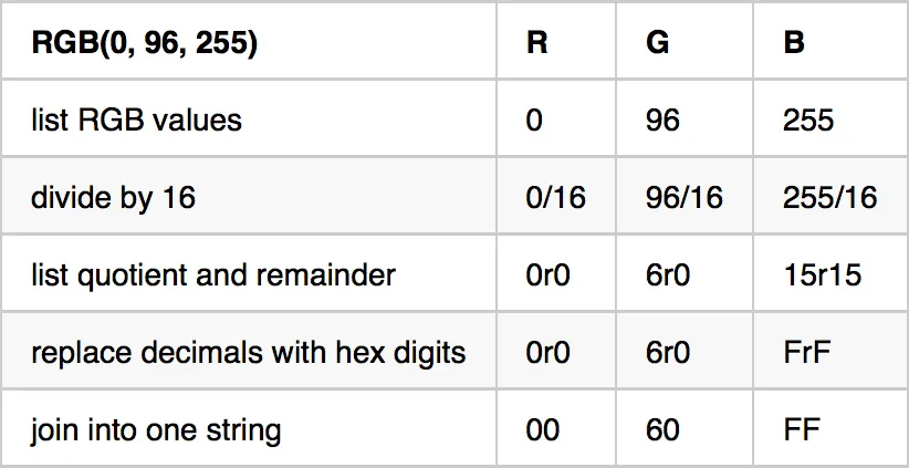
RGB(0,96,255) = #0060FF
Approximating hexadecimal channel ratios
The mental math for exact hex conversions can be slow and confusing at first. The best way to develop an intuition for how hexadecimal RGB works is just to approximate: you’ll get sharper and sharper with time until it’s second nature. Here’s an easy approximation scheme:
1. Split the hex string into 3 groups of 2 characters just like you would for a conversion to decimal.
2. Round each channel’s value to the nearest 0.
- If the second digit is 8 or above, round up (e.g. 3A rounds to 40); you can round high Fs to a theoretical G0
- Otherwise round down (e.g. 37 rounds to 30)

3. You now have a rough ratio for your channel mix: the first digit tells you approximately how many sixteenths of that color you’ve added.
For example: #873AFF rounds to 80 | 40 | G0. 8/16 red, 4/16 green, and 16/16 blue gives us an approximate 2:1:4 RGB ratio.
- Remember when we added green by 1/8 increments to our first blue swatches? 1/8 = 2/16; you can clearly see us adding 2/16 of green each time the first digit in the green channel’s hex number increases by 2.

- You’re in good shape when you get to the point where you can look at #0060FF and quickly tell that it’s full blue with some green mixed in (a little less than half the channel).
- Using our estimation technique from above, we can quickly see 6/16 green and 16/16 blue which simplifies to “3 parts green, 8 parts blue.” At this point, you’re seeing hexadecimal RGB color like a painter sees a palette.
So there you have it, a primer for getting started with mixing in RGB. To recap, some of the advantages of mixing in RGB are:
- The ability to create more organic color relationships using channel ratios
- The opportunity to arrive at color palettes using a system that encourages discretionary relationships (much like the grid does for layouts)
- The congruence of building color palettes using the parameters of the color space itself as mixing model
- Not having to worry about the sometimes arbitrary effects of saturation and brightness on different hues or the 360º of the color wheel
- The convenience of developing an understanding of working with hexadecimal RGB color
Happy mixing!
Did you enjoy this post? Message me on X (Twitter) and let me know what you liked about it.